Permit.com
Refining the Permit Application Process
Faster Design and Development
By working in tandem with a small in-house team, we doubled the pace of development for a key business application.
Time Savings
We refined processes and found ways to reduce the amount of time team members took on specific tasks so they could eliminate frequent 60-80 hour work weeks.
Higher UX Maturity
We showed how UX maturity and deep thinking can drive real business results and help improve products over the long haul better than building it based on urgent requests.
Impact
Faster development pace by working in tandem with the in-house team
A Service That’s Easy for Customers but Hard on Staff
Permit.com has more than 25 years of experience managing construction permit applications for global corporations as big as Starbucks and McDonald’s. The team has created a turnkey process that makes it easier for their clients to manage permit applications for large projects. The problem was that the internal tools to manage these applications put a lot of stress on the Permit.com team.
They asked Drawbackwards to help find ways to improve their internal project management tool. The team knew it was clunky and it made simple tasks too complicated. But with a single developer and no designers, they had no bandwidth to step back and take a look at the bigger picture. It was a classic case of building the bike while you ride it. Each new feature was a response to an urgent request, rather than a strategic UX decision.
Create More Efficient Tracking Tools to Deliver Better Service
Permit.com needed to overhaul and streamline its processes, while also modernizing the user interface used to manage them. The ultimate goal was to reduce the time and effort it took staff to manage the application process. Inefficiencies were stretching the small Permit.com team to the max. At the same time, they needed to prepare for future expansion of their services and tools. They wanted to provide more self-service options for clients and vendors. Helping clients manage and track the tasks they had to complete would help keep applications moving faster. Investing in these improvements now would deliver better business results in the future.
Carving a Big Challenge into Manageable Two-Week Sprints
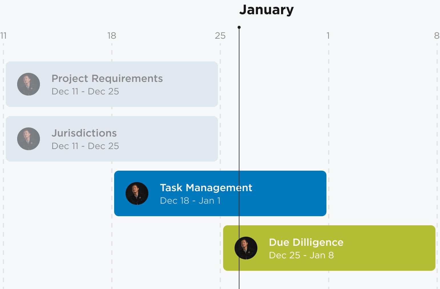
Our first step in a project this sprawling is to break it up into smaller chunks. Our Drawbackwards team worked with Permit.com to set up an ongoing two-week sprint schedule. For each two-week sprint, we would deliver sketches, wireframes, or visual designs based on the top current priorities. Our teams would collaborate to identify the focus for each sprint ahead of time and agree on the sprint pace. Any other iterations or work that arose during a sprint would get assigned to a future sprint.
This approach helped our team stay in lock step with the Permit.com team. We could adapt to new needs as they emerged, while still providing a predictable schedule of deliverables. It also helped the single developer move faster because we could work on new designs while he put the previous round into code. We also built in the capability to do UX research when needed to uncover insights into user needs and pain points or test in-flight designs. Our regular sprint cadence doubled the pace at which Permit.com was able to address its deepest needs.
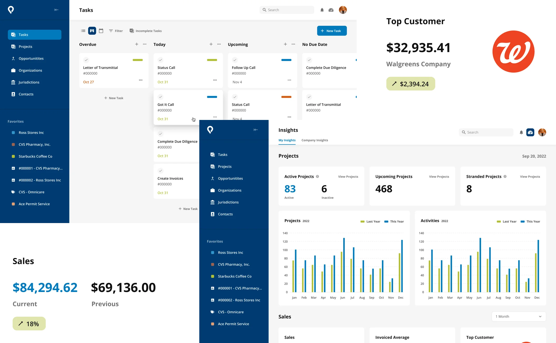
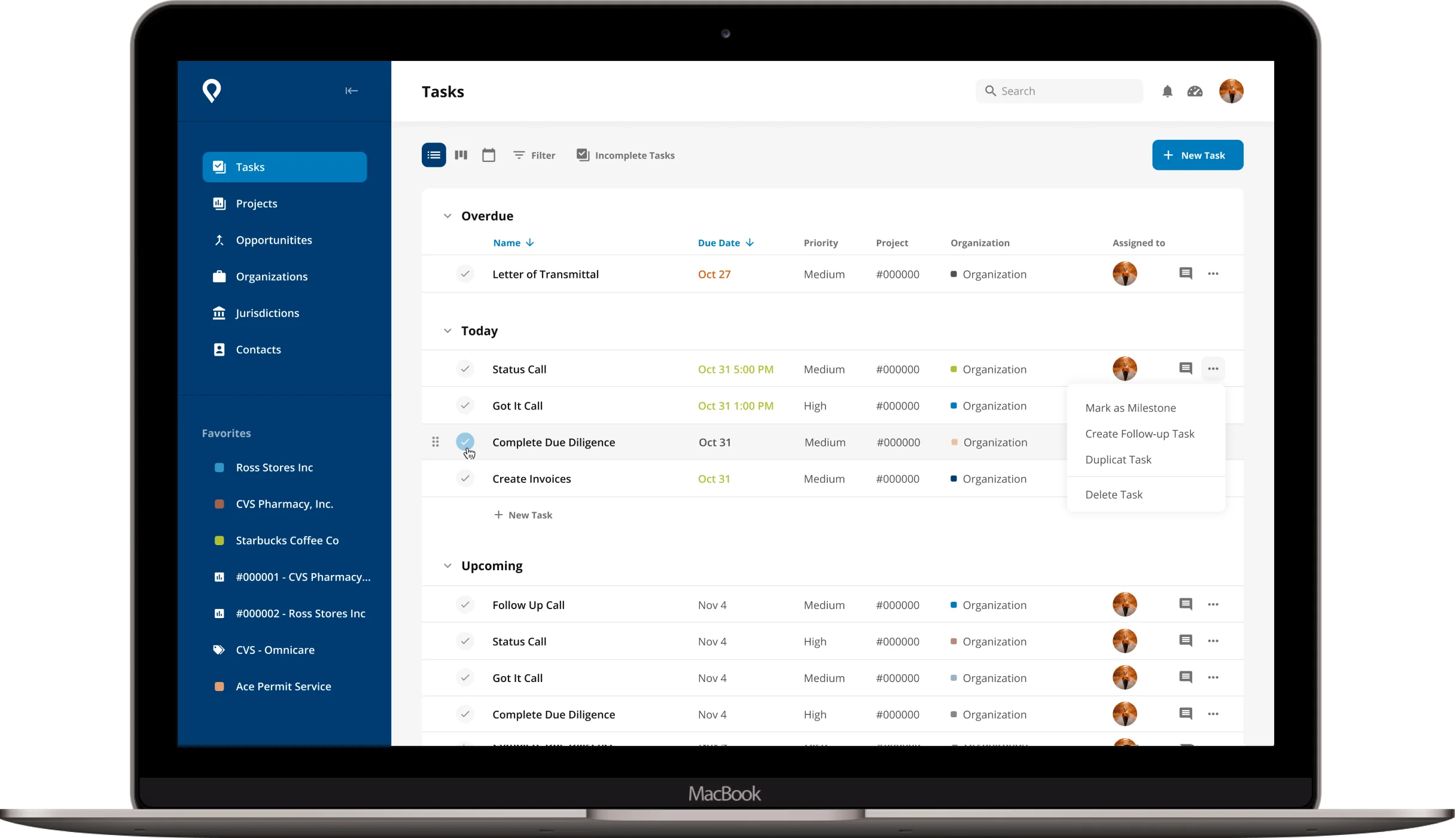
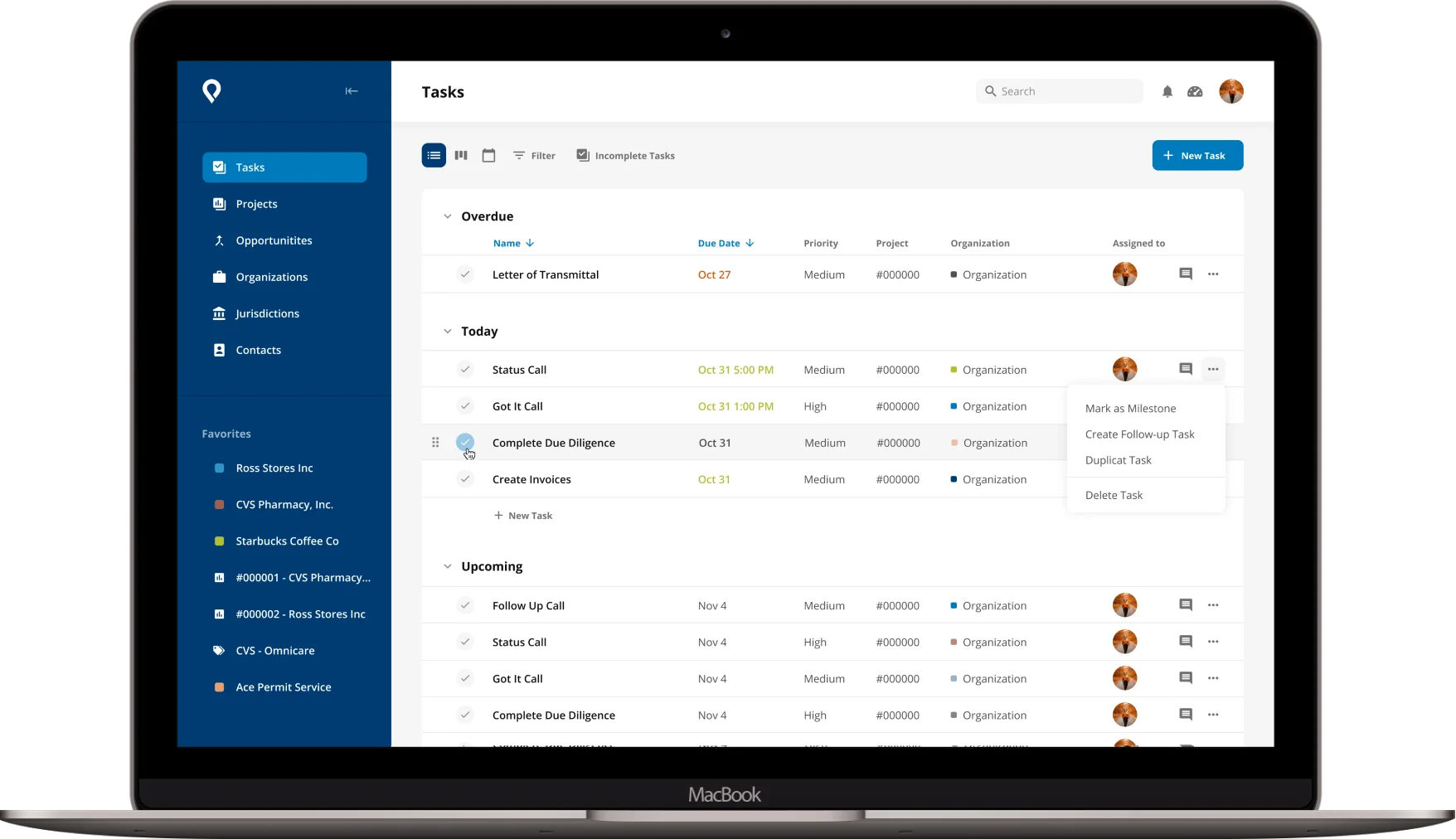
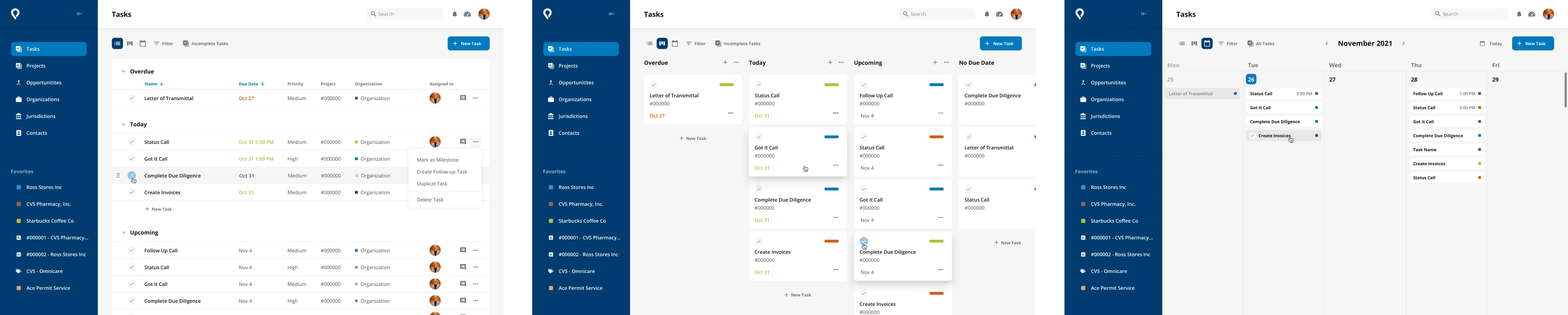
Giving Users the Power to Manage Projects
One of the problems at the heart of the issue was how tasks were being managed within the existing tools. The system was reactive instead of proactive. Permit.com staff would track the bulk of the process in their heads and then log what they had done after the fact. For example, they would have a call with a client and then enter the call into the system after it took place.
We knew we needed to build a more proactive system. We wanted to create something that operated more like a best-in-class project management tool like Asana. With this approach, staff could create and organize tasks ahead of time, assign them to specific users, and track their progress. This would help them manage the lifecycle of the project as a whole rather than record individual actions.
Simplifying Features to Reduce Workarounds
To create a more proactive system, we needed to introduce new features like Lists, Boards, and Calendar Views. We also needed to simplify the existing features and processes they supported. We saw some classic signs that internal processes were not working as well as they could. The Permit.com team told us that new hire training was difficult and time-consuming. Trainers would often teach their own individual workarounds or hacks they had developed to get things done. Each time they needed to pass along knowledge, they had to remember how to do specific things and spend time and energy explaining it to others.
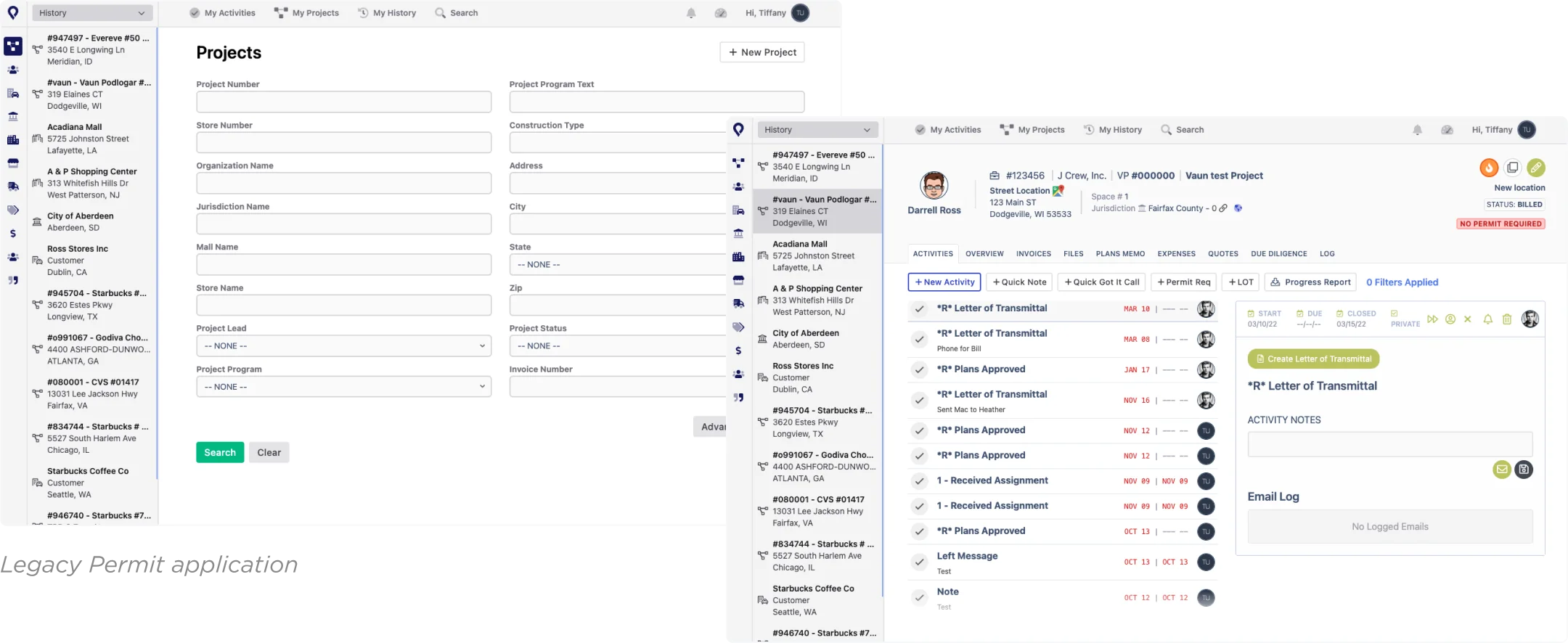
Looking at the user interface, it was evident that this complexity had seeped into the product as well. Pages in the tool started with a blank search box and no results. Staff had to remember specific project or store numbers to generate a list of results. With hundreds of projects living in the tool, that was a huge mental load on the user. Features meant to be helpful were either not designed particularly well or not used as intended. We found examples in our UX research of people using the navigation in unintended ways and following their own workarounds.
To fix this, we focused on the place where the most important information lived - the Project detail screen. We introduced a task-based design that helped staff track what they needed to do next with reminders and other tracking tools. Giving the user control over what they need to do next made it feel more comfortable and usable. The system was now supporting them and their needs rather than forcing them down a path they didn’t want or need. This kind of reframing can make it easier and faster to navigate even the most complex processes.
Getting a Lay of the Land with UX Journey Mapping
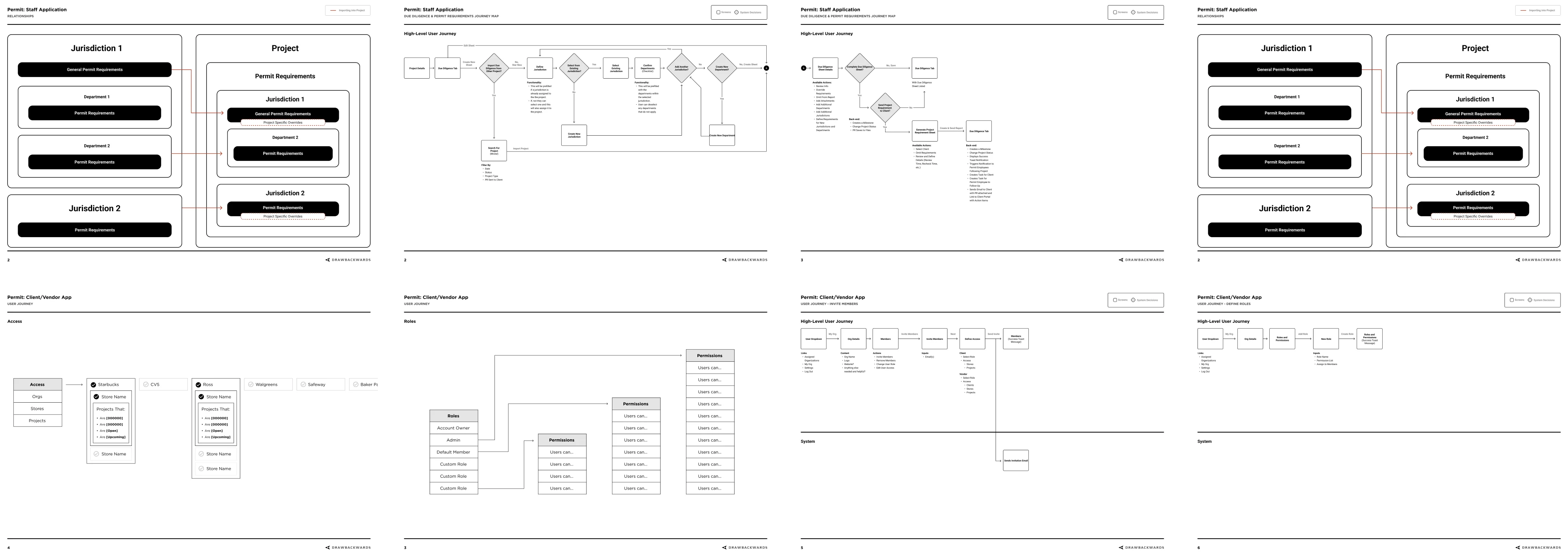
The complexity of the permitting process has a lot to do with the complexity of the relationships between different agencies. On any given project, Permit.com’s clients may need permits from a wide range of authorities and jurisdictions. Each of these permits has its own requirements and timelines and some are dependent on each other. We needed to better understand the hierarchical structure of these relationships.
This was a perfect challenge for us to address with our UX mapping tools and techniques. We created visual representations of these relationships to see how they connected to the user experience. What that showed us was a huge bottleneck where the team did what they called “due diligence.” This is the part of the process where the Permit.com staff needs to work with clients to get the necessary documentation and information.
The end goal of this due diligence process is to create a clear list of requirements for the permit application to be successful. Clients need to know what to provide, and Permit.com staff need to track each item as it comes in. The existing system was producing a long and detailed list of requirements in a PDF that was hard to read. Clients often ignored this and asked staff for a bulleted list through email.
To understand this due diligence process in more detail, we held a half-day workshop with Permit.com staff. During this workshop, we created detailed user flows and maps to explore how to make the process easier. With this effort, we were able to improve the logic for filling out task sheets. We created dependent forms that asked yes/no questions so we could automatically skip unnecessary steps. We then tested prototypes of these new flows with users and refined them through iterations until we got it right.
Setting the Foundations for Future UX Maturity
At the time of our engagement, Permit.com had one developer and no designer. UI designs happened ad hoc as the app was being built. As we see with many small teams, the developer only had so much time to contribute to deep UX thinking. He needed to respond to requests and requirements and didn’t have the luxury of thinking about nice-to-haves. One of our goals in any engagement is to help our clients generate more business value by increasing their UX maturity.
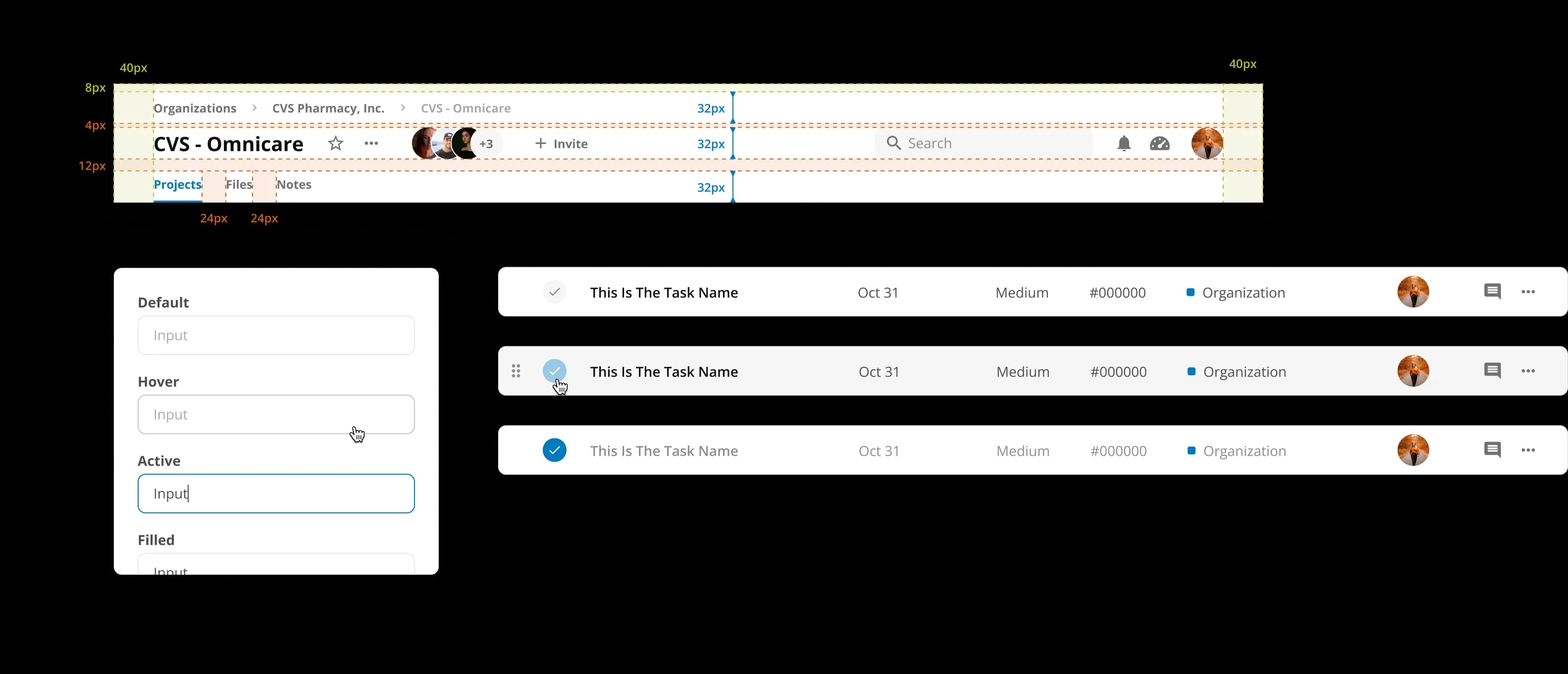
Not only did we help the entire team take a step back and better understand the big picture, but we also started to create tools to build UX maturity. We worked with the team to create a detailed style library to record and represent the existing product. This guide defined components, header styles, and other elements like breadcrumbs and tabs. It also created a framework for future design decisions.
Creating a Seamless Unified Experience
The final piece of the puzzle was to unify the pieces we were crafting into a cohesive whole. The internal staff tool needed to look and feel like the client and vendor tool. The marketing site needed a refreshed design to make it feel more representative of the current Permit.com services. And every piece needed to support the future growth of the business.
Our team helped iron out the minor stylistic differences between the tools and platforms. We also did some branding work to create a more consistent look and feel. Finally, we made sure that the changes we were making in the staff tool were consistent with the changes in the client and vendor tool.
Better UX for Better Business
When we started this engagement, the Permit.com project management tools and processes were stuck. There wasn’t a lot of functionality that enabled users to take control and efficiently do what they needed to do. Our work with the team increased the visibility and control that staff, clients, and vendors could have over their projects. We also set the foundation for a client portal that can one day be a one-stop shop. In the future, it can expand to include other services that will make the permitting process even easier. We worked together as a unified team to lay the foundation for future business growth.