Matrix Medical Systems
A Better Experience for Better Care
Time Savings
Improved usability and clearer navigation for less charting time.
Validated Strategy
Research-driven design, every step of the way.
Care First
Empowering clinicians to do less charting and more caring.
Impact
Annual labor savings, reduced visit times, improved clinical documentation and accuracy
A System That Works for Users, and Not the Other Way Around
As an in-home health assessment provider, Matrix Medical Systems faced challenges of competitive daily margins, clinician fatigue, and intense medical charting compliance. To magnify those challenges, Clinicians were saddled with an unresponsive and inconsistent tablet application used during visits to enter data. Through design, research, and front-end development, Drawbackwards improved this app—called CHAT—to boost usability and reduce effort, allowing clinicians to focus on what’s most important: caring for members.
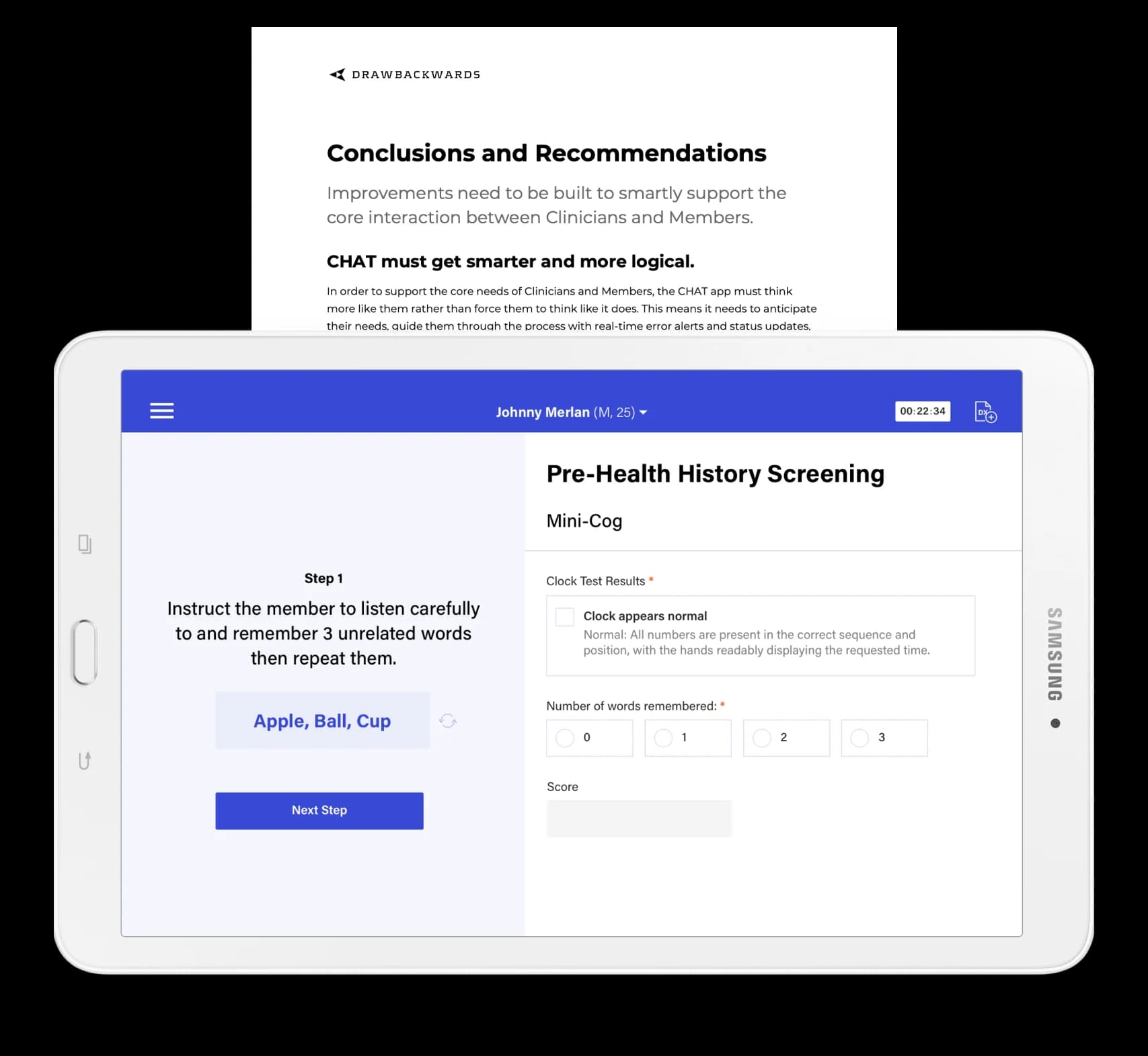
While the original CHAT app was a marvel of Matrix resourcefulness, it heavily relied on pre-made components and frameworks. The resulting product experience, which we’d rank as Functional, was a testament to those constraints—the touch response was poor, logic was nearly nonexistent, and the combination of unclear technical copy, lack of visual hierarchy, and information architecture caused a huge amount of cognitive load to Clinicians.
The low usability of CHAT was contributing to an already difficult scenario: Clinicians were tasked with leading visits without getting off-track or over-time while asking a litany of health-related questions, performing exams, fulfilling diagnostic tests, and educating members on their health. CHAT further hindered the ability for Clinicians to quickly and accurately enter information, creating opportunities for errors, non-HIPPA compliance (such as writing physical notes including patient information), and hours of charting outside of the workday.
To hit the ground running, we attended a demo of the application before our first kickoff workshop to prepare an initial ‘hit list’ of improvements Matrix could start with right away. We presented those suggestions in our initial kickoff workshop, in addition to aligning business groups to shared goals, conducting user empathy exercises, and prioritizing the next steps. We then got to work with a focus on the success metrics established by the team. Matrix needed to enable quicker visits, better accuracy, and reduced charting rework. We crafted a plan to pair design and research together, in order to validate decisions as they were made and reduce investment risk on Matrix’s part.
Compounding Changes, Big Improvements
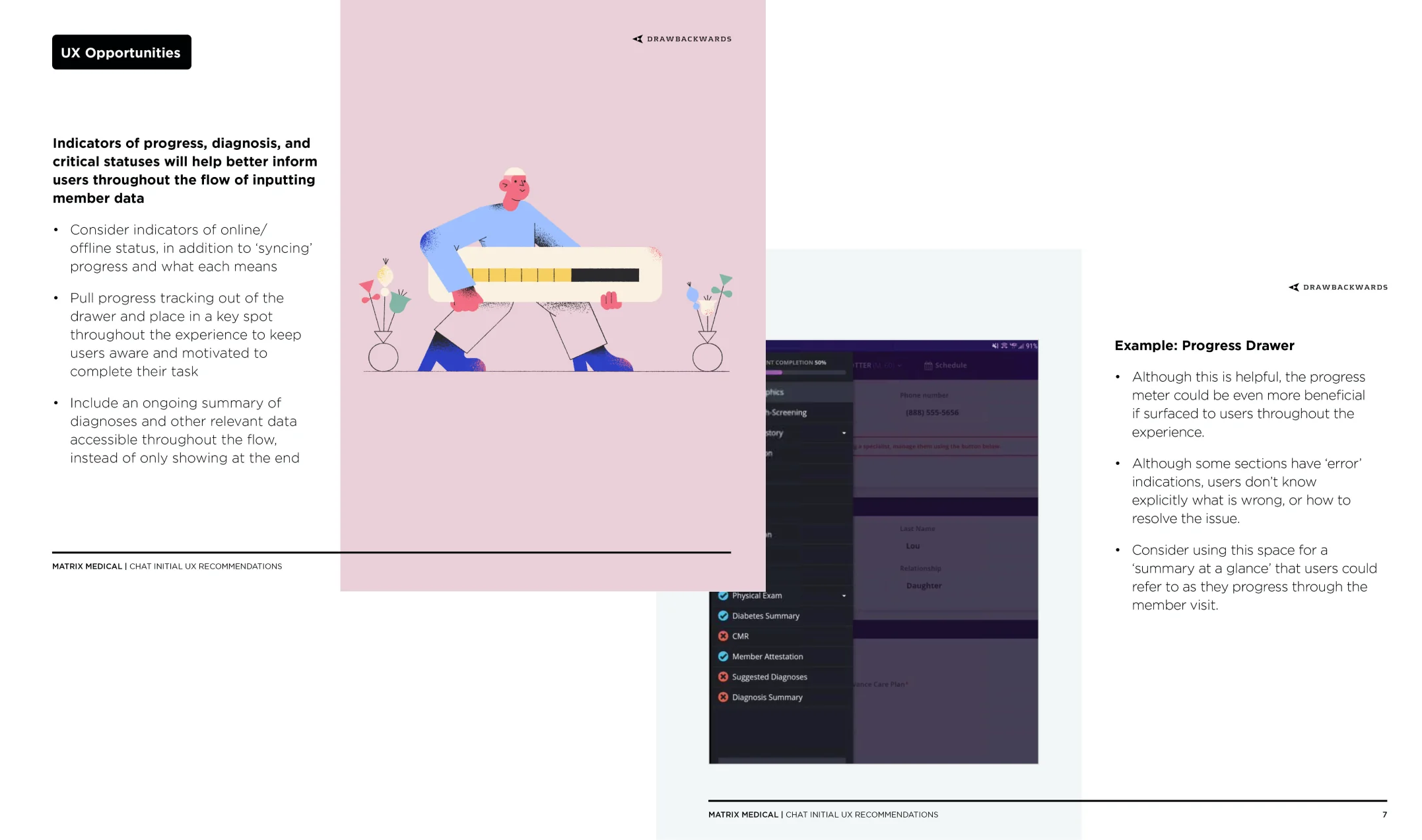
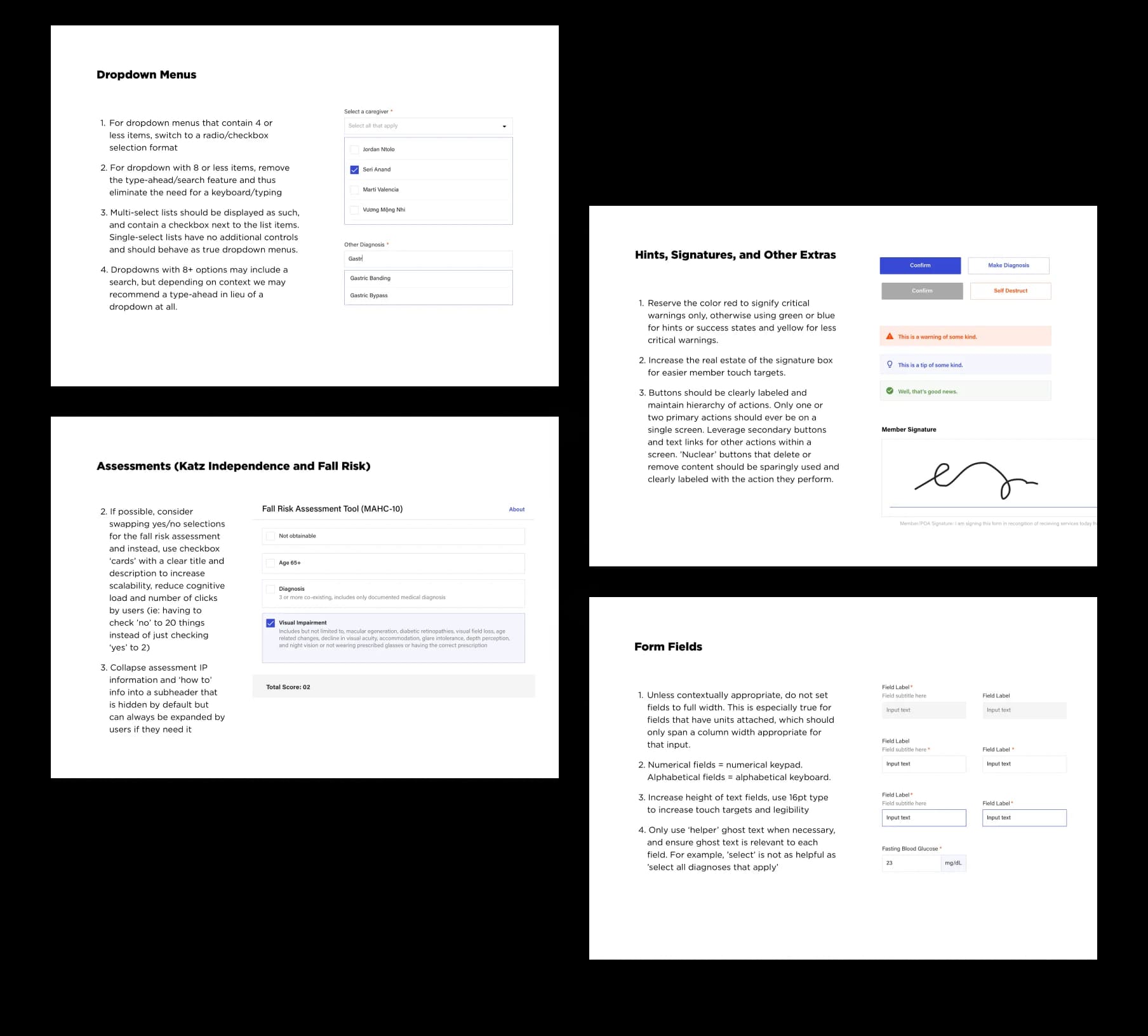
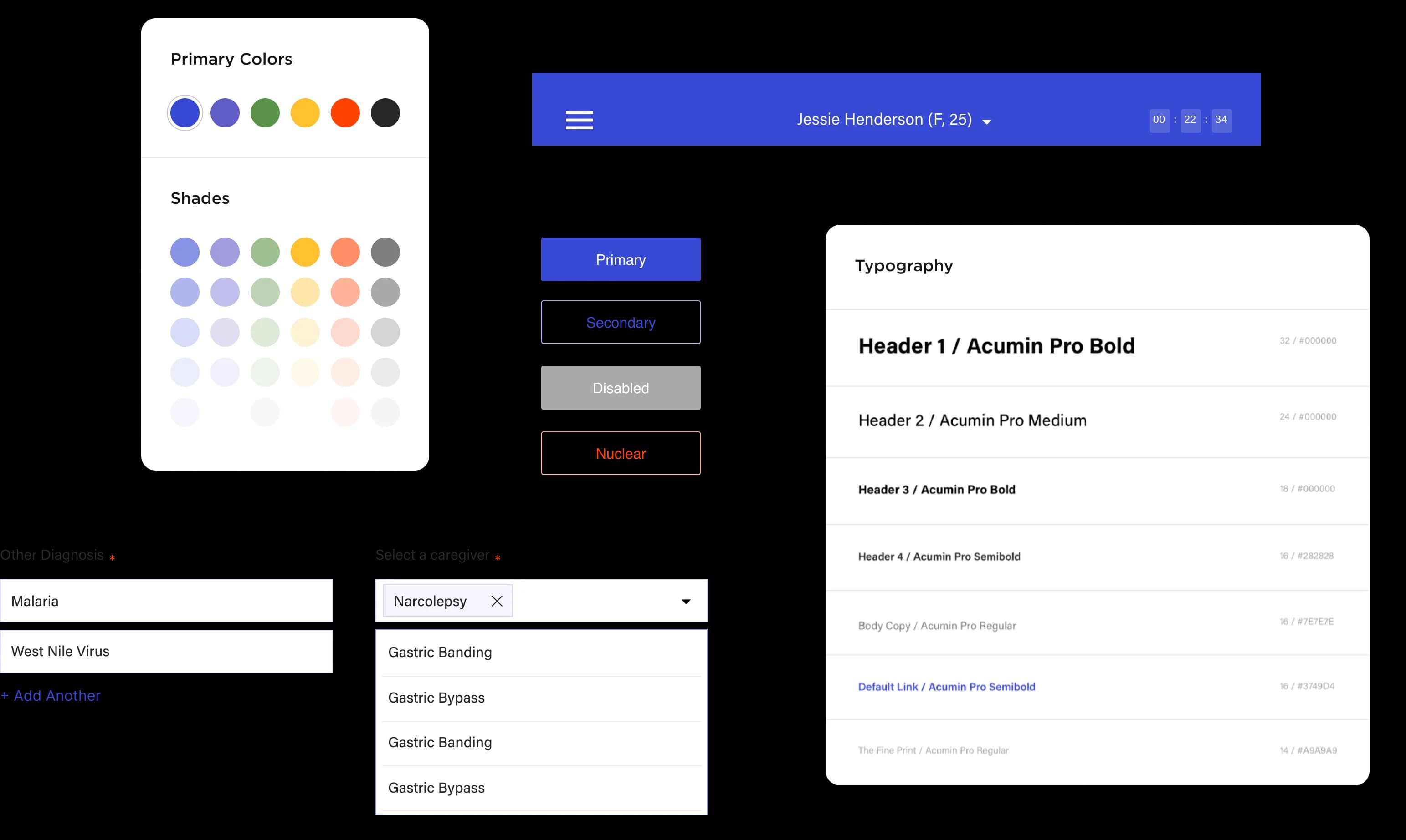
With the interest of making quick, high-impact changes, we started with an audit of the existing UI components. By refining the building blocks of the app, we made improvements universally across the experience. One of the most substantial changes during this phase was the correction of misused dropdowns—a significant barrier to quick data entry, especially for fields that only had two or three options.
Next, we leveraged those initial component suggestions to craft a full design system that prioritized high legibility, large touch targets, and clear visual hierarchy. In tandem, our research team was actively interviewing Clinicians to collect baseline data and validate the design decisions made.
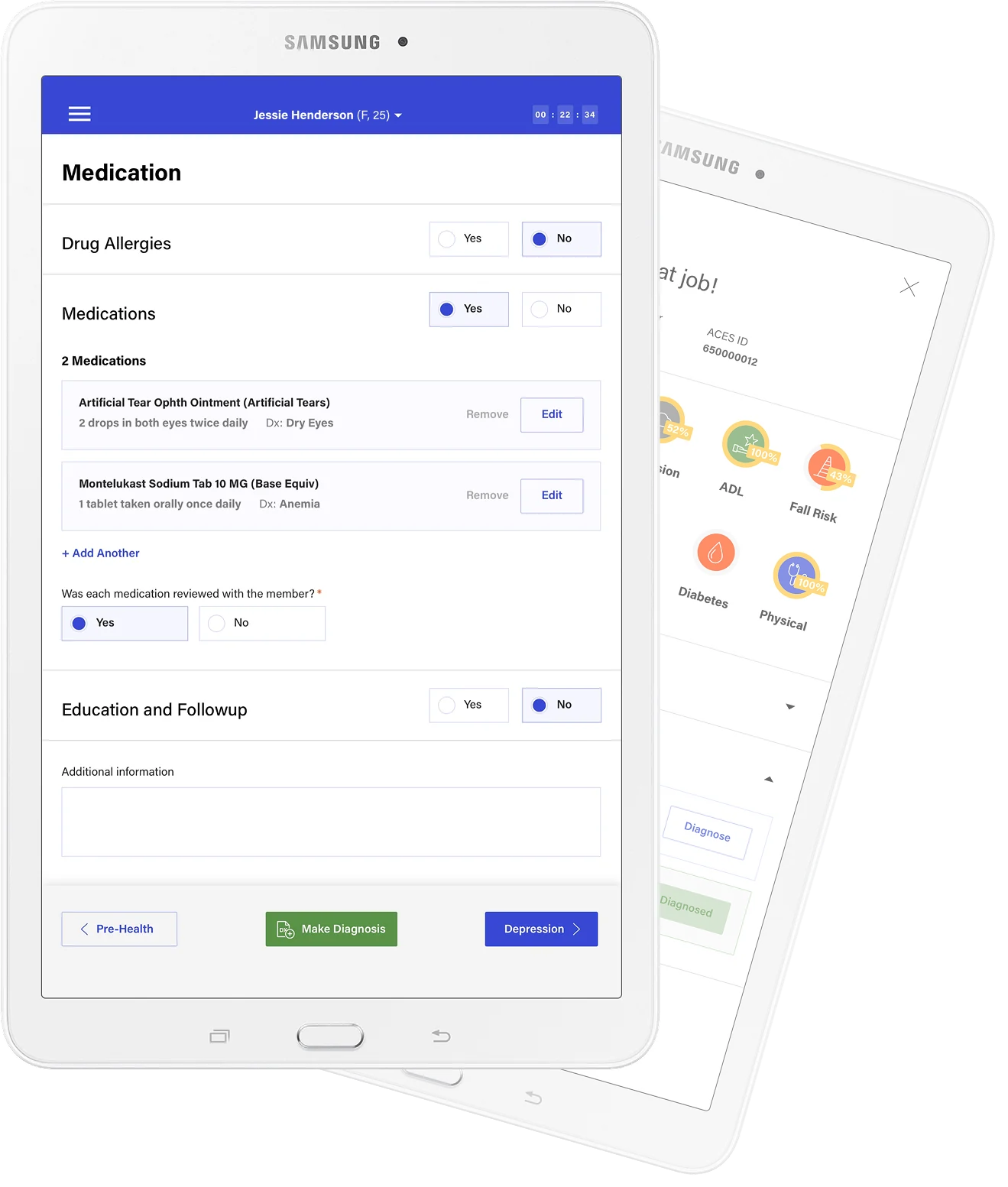
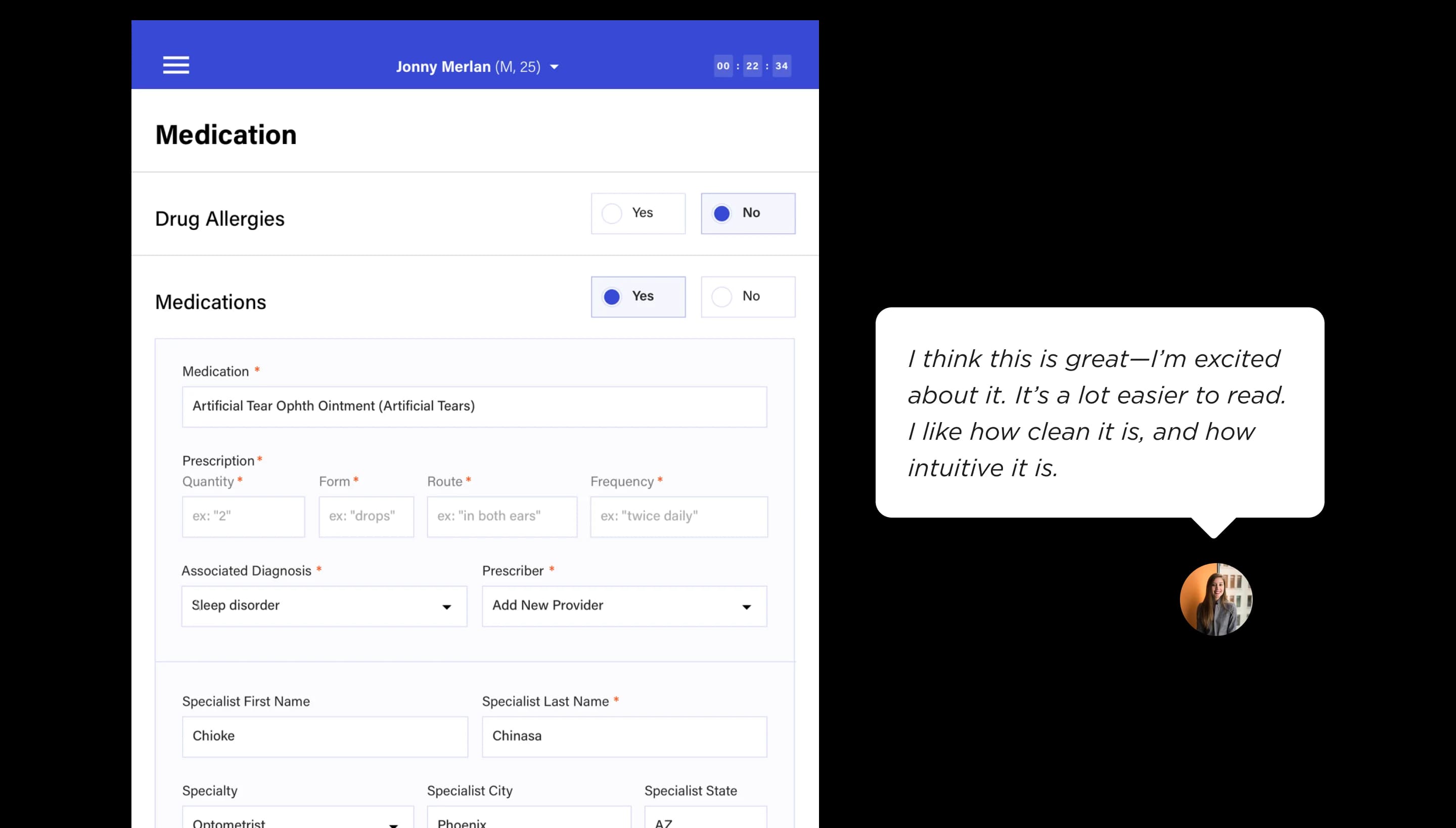
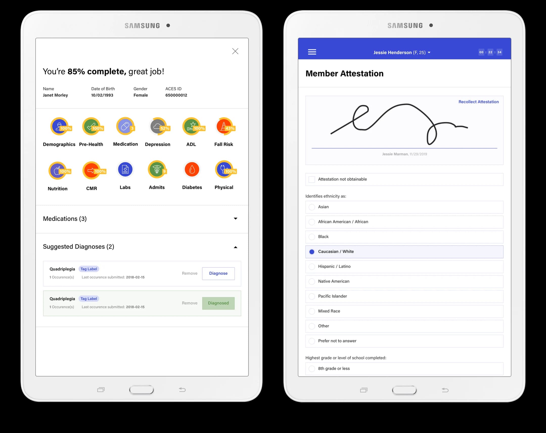
Through user research sessions and screentime analysis, we identified the most problematic sections of the application, which were to be our next design focus: medications, diagnoses, and the physical exam. Following those sections, we worked closely with Matrix’s clinician liaisons to identify and prioritize the most impactful screens to focus on next. This process of design, validation, and review continued to cover the full health assessment flow—with a total of over 200 screens re-designed for usability, clarity, and consistency.
Creative Solutions to Accommodate Constraints
In order to implement design changes, our team of designers and developers worked closely and creatively with Matrix’s QA team to ensure alignment with their data model and out-of-the-box framework. Even with some challenging security constraints and restricted editability, our deployments were successful and brought real improvement to the app, on an aggressive timeline. In addition to design adjustments, we improved multiple app issues—touch response and latency, and keyboard appearance—that had severely crippled usability until that point.
Future-Forward Strategy and Research
As design sprints continued and more of the health assessment was addressed, research sessions helped us understand that many of the pain points within a Clinician experience spanned beyond the app itself. We proposed conducting an in-depth diary study to better capture those ulterior challenges, so as to address them. Matrix agreed, and after a week of daily entries from numerous Clinicians, Drawbackwards produced a comprehensive report of the findings and recommendations that would benefit employees, members, and business alike. Our ultimate goal: to continue designing a holistic experience and system suited for humans, rather than machines.