Choice Hotels
Boosting Bookings with a Modular, Mobile-Friendly Experience
Collaboration
Integrated with in-house research and design teams to work as one cohesive unit.
Delight
Made the user experience more relevant, refined, and delightful.
Flexibility
Created a modular design to make it easier to create customized pages.
Impact
Reduction on booking churn, increase in on-site bookings, improvement in customer loyalty
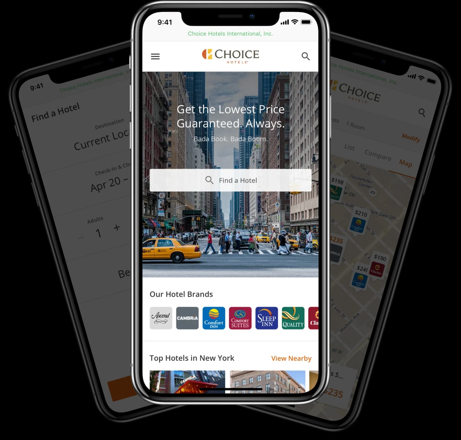
Creating a Choice Booking Experience Across Devices
Over the past few years, Choice Hotels, the parent company of several well-known hotel brands including Comfort Inn and Sleep Inn, has been facing several challenges due to changes in the market and their business — challenges that required a fresh pair of eyes to solve. First, more and more people were using mobile devices to book rooms, yet Choice’s conversion rate was much lower on mobile than desktop. Secondly, they were investing more in upscale brands, such as Cambria. However, the online experience for Cambria was the same as it was for their midscale and economy hotels, so it wasn’t meeting the needs of upscale customers or differentiating the premium brands to drive bookings. Plus, Choice was concerned that visitors were getting confused when they searched for a specific hotel brands on a search engine or online travel agency (like Expedia or Kayak) and landed on the Choice website — a brand they may not be familiar with.
Through a UX design subscription with Drawbackwards, Choice saw the power of design thinking and developed smart solutions for all of these challenges, leading to an increase in mobile bookings and an all-around better user experience.
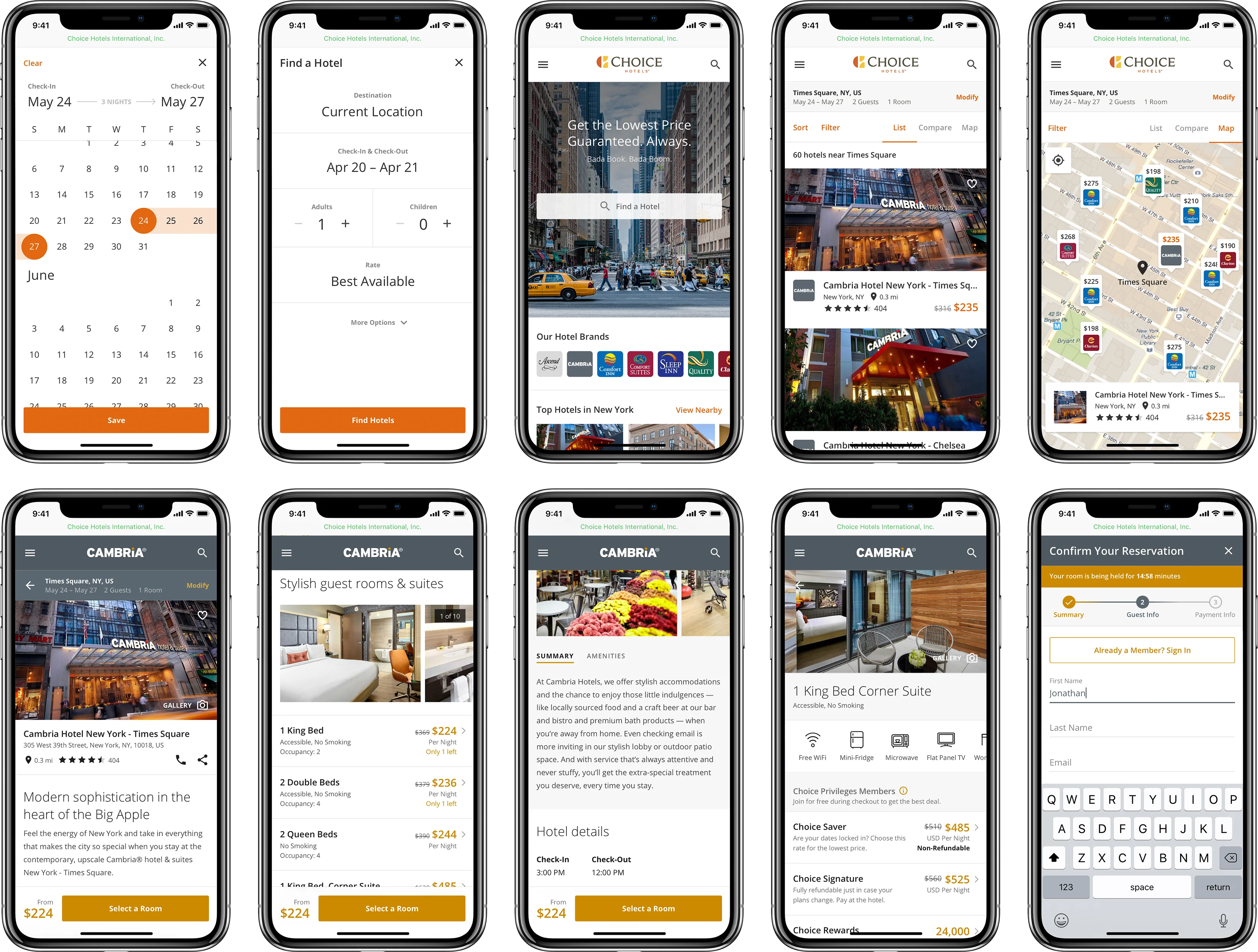
Improving the OTA Experience from OK to Grade A
Choice Hotels had several hypotheses about the pain points visitors were experiencing when they landed on the Choice website through an online travel agency (OTA), so our team followed a design thinking process to validate their hypotheses and develop innovative solutions. First, we started with user research to learn more about their needs and uncover opportunities for improvement. Using existing usability research from Choice and remote moderated usability tests conducted by our team, we honed in on the most important content customers are looking for when they search for a hotel room on OTAs like Google, Expedia, and Kayak.
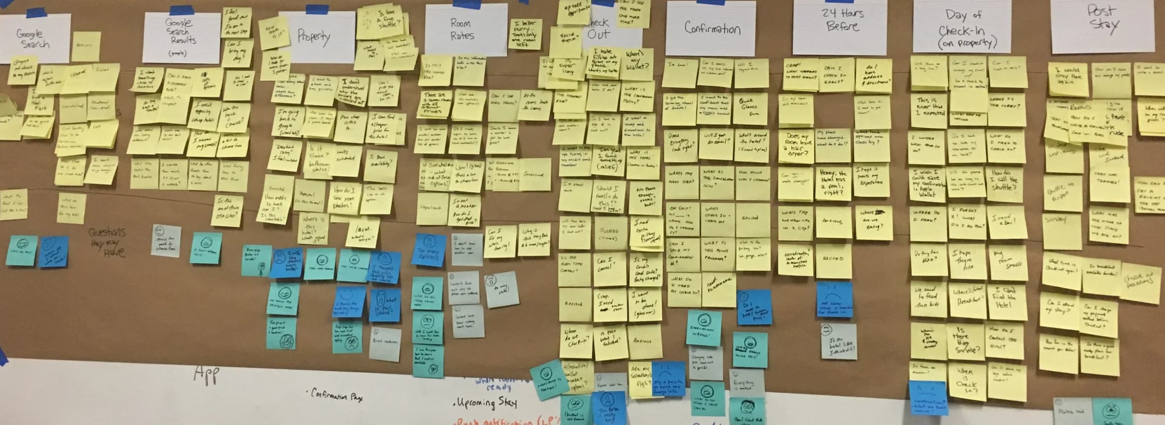
Visualizing the End-to-End Experience with Journey Mapping
With research findings in hand, we collaborated with Choice’s team in a journey mapping workshop to map the entire customer experience, from their initial search, to reservation confirmation, to check-in and beyond. Seeing the experience from beginning to end helped pinpoint the high points and low points of the journey from the customer’s perspective, as well as the information they were looking for at each stage.
Research, Sketch, Refine
Choice wanted to move quickly, so we used double sprints to work concurrently, get more done faster, and continuously test our work. For example, while half of our team was doing research, the other half was doing rapid sketches to explore tons of potential ways we could improve the experience. When research and sketching were complete, we came together to compare our sketches against the research, select the concepts that would best meet both the business and user needs, then adjust them based on the results.
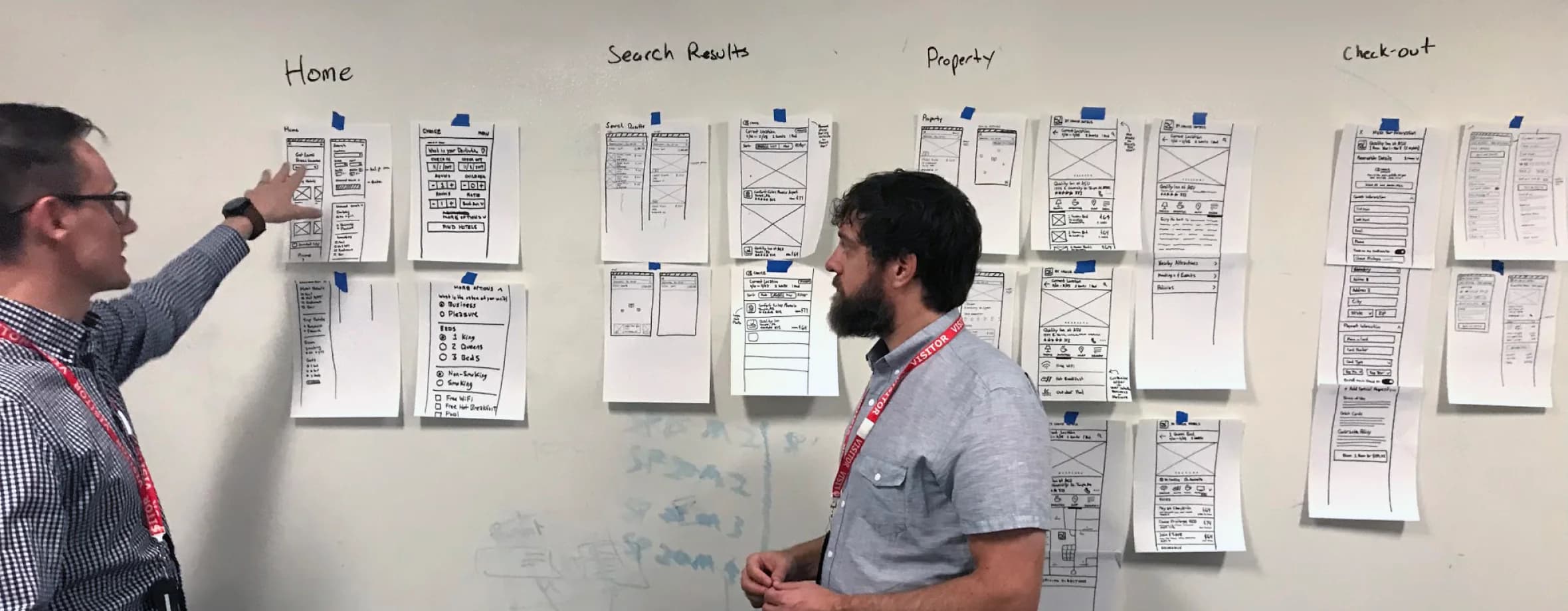
From Rough Idea to Clear Wireframe
After refining the mobile sketches, Drawbackwards started bringing them to life so we could test the concepts with real users as quickly as possible. Turning the sketches into wireframes first helped everyone begin to see how the content would be displayed on each page, as well as how users would go through each step of the typical booking process from start to finish.
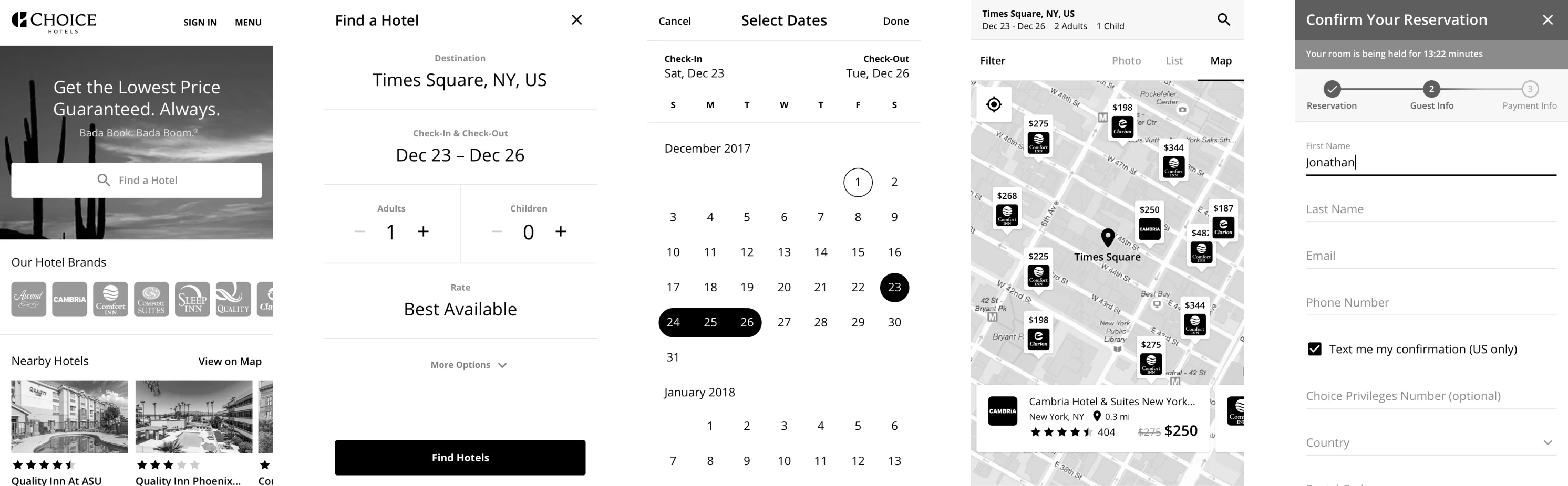
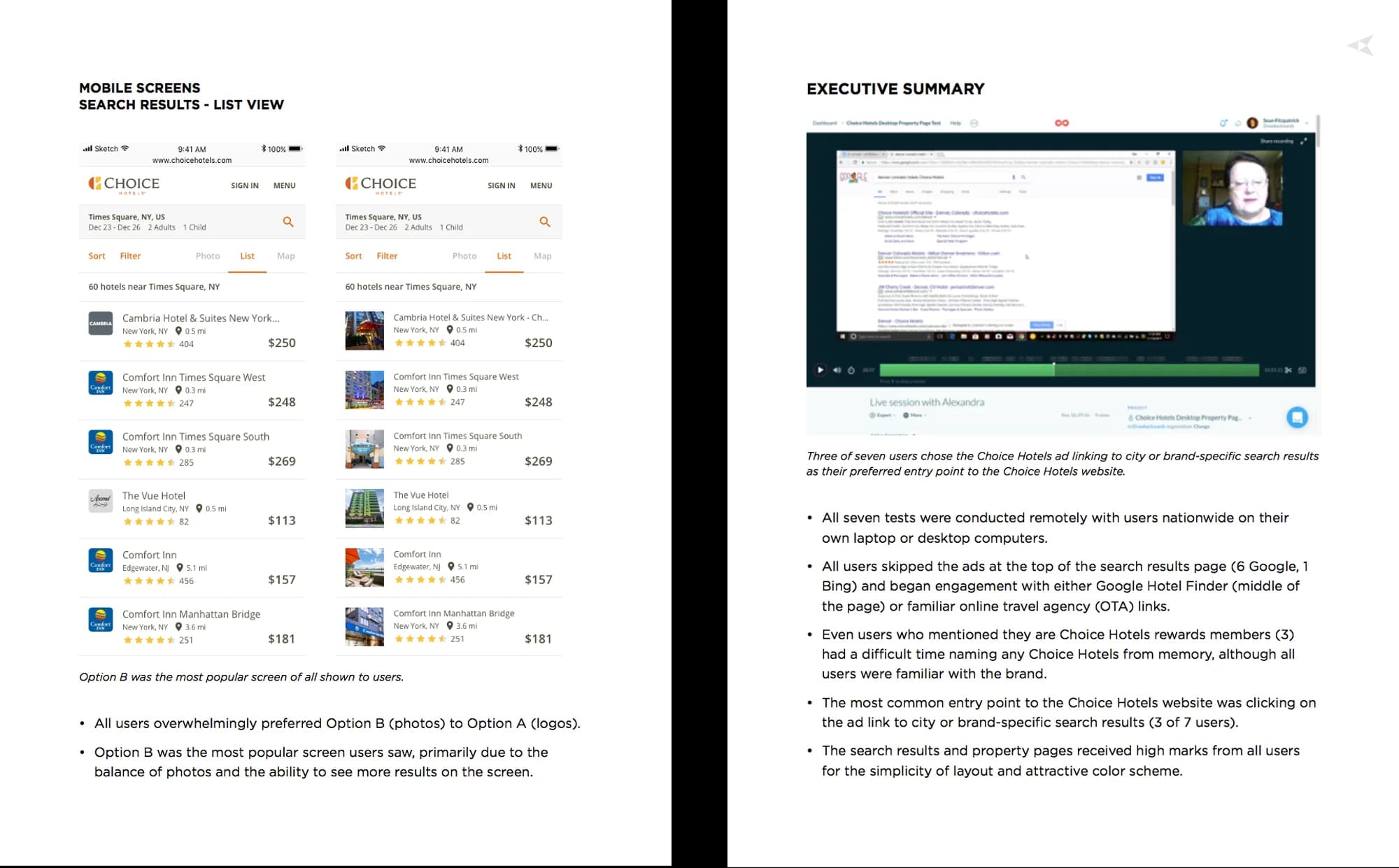
Prototyping and Testing to Get Real Feedback from Real Users
Testing concepts was a priority for our team and Choice Hotels, so we quickly converted the wireframes into clickable prototypes. This allowed us to test multiple ways to display information and see which idea resonated most with real people. For example, we tested several formats for search results to see whether users prefer to see hotels displayed in a list, map, or table, as well as what they would call each view so we could determine appropriate terminology.
Bringing the Brand to Life with Visual Design
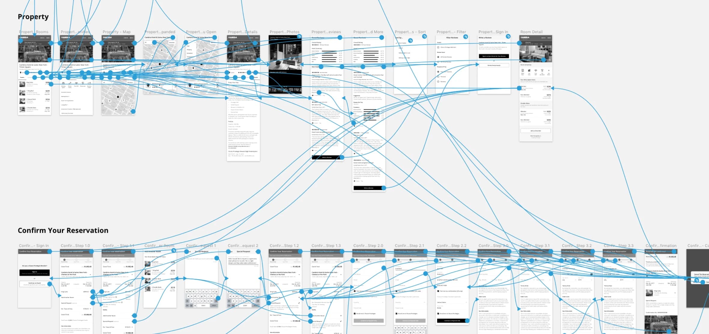
After doing usability testing with the prototypes, we had valuable insights to inform visual design and development. This step of the process involved several rounds of iteration to test and refine specific elements of the experience. Our goal was to not only optimize the pages for mobile, but also to create a cohesive UX design system so all of the hotel brands feel unique, yet connected and consistent. Choice Hotels was also updating their brand guidelines at the time, so many of the visual design decisions used for this project influenced the new guidelines their internal team was developing.
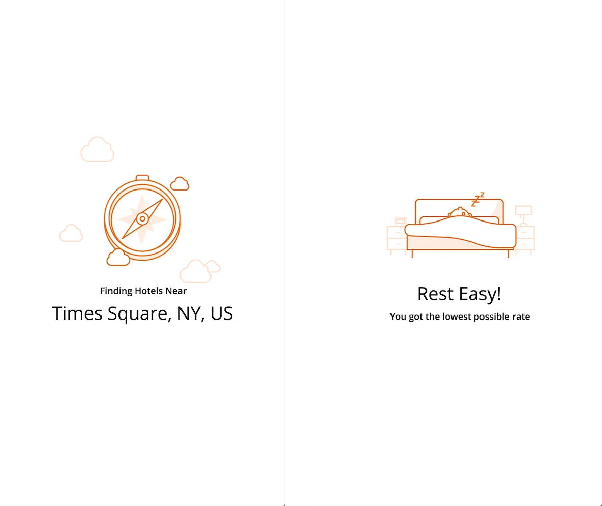
Interactions Infuse Delight
Once the new mobile experience was functional, usable, and comfortable for users, we kept working up the Experience Success Ladder to infuse delight. Interactive elements, such as a spinning compass when searching for hotels and a slumbering guest when the reservation is almost complete, help minimize perceived wait times and add little surprises throughout the process.
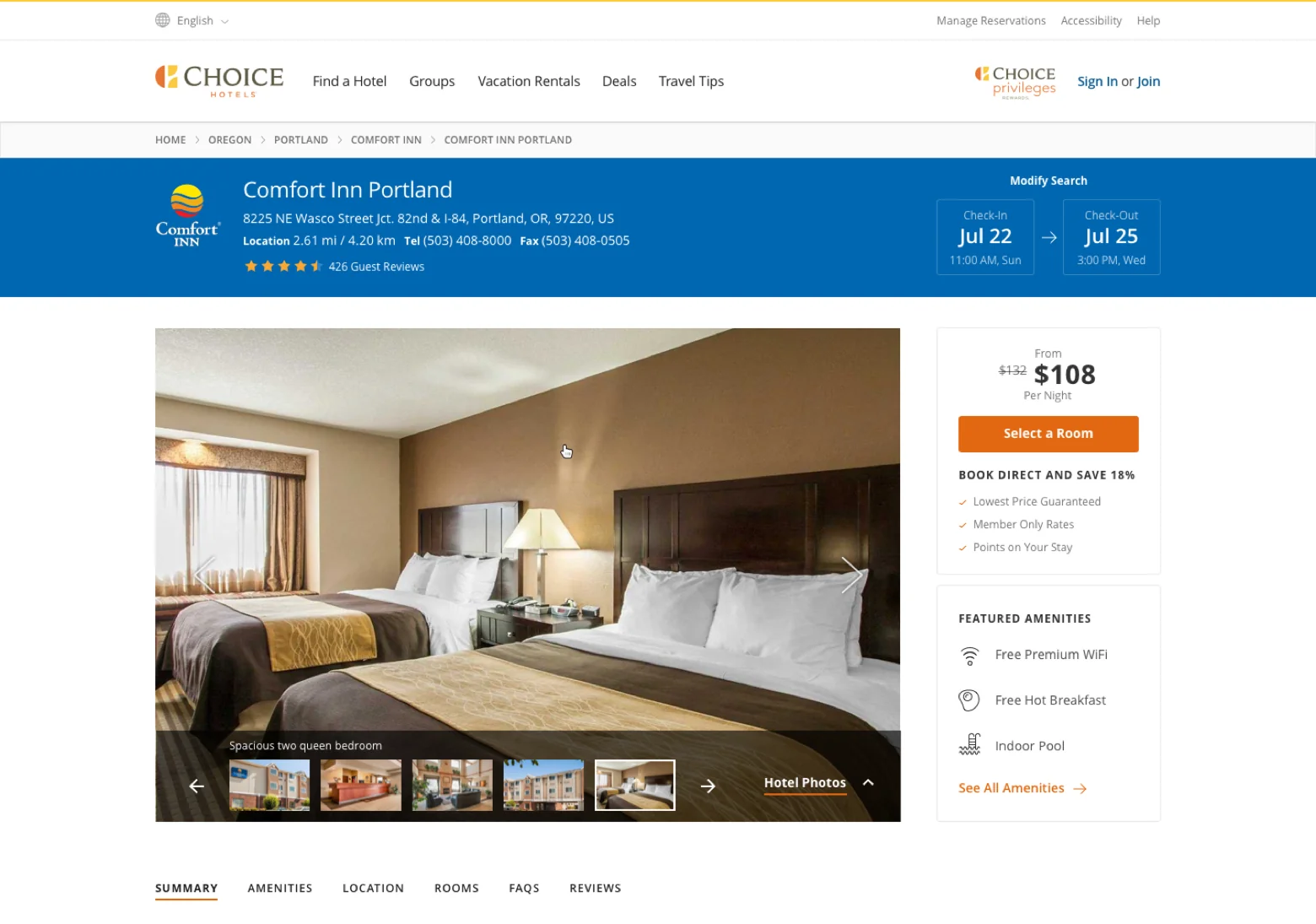
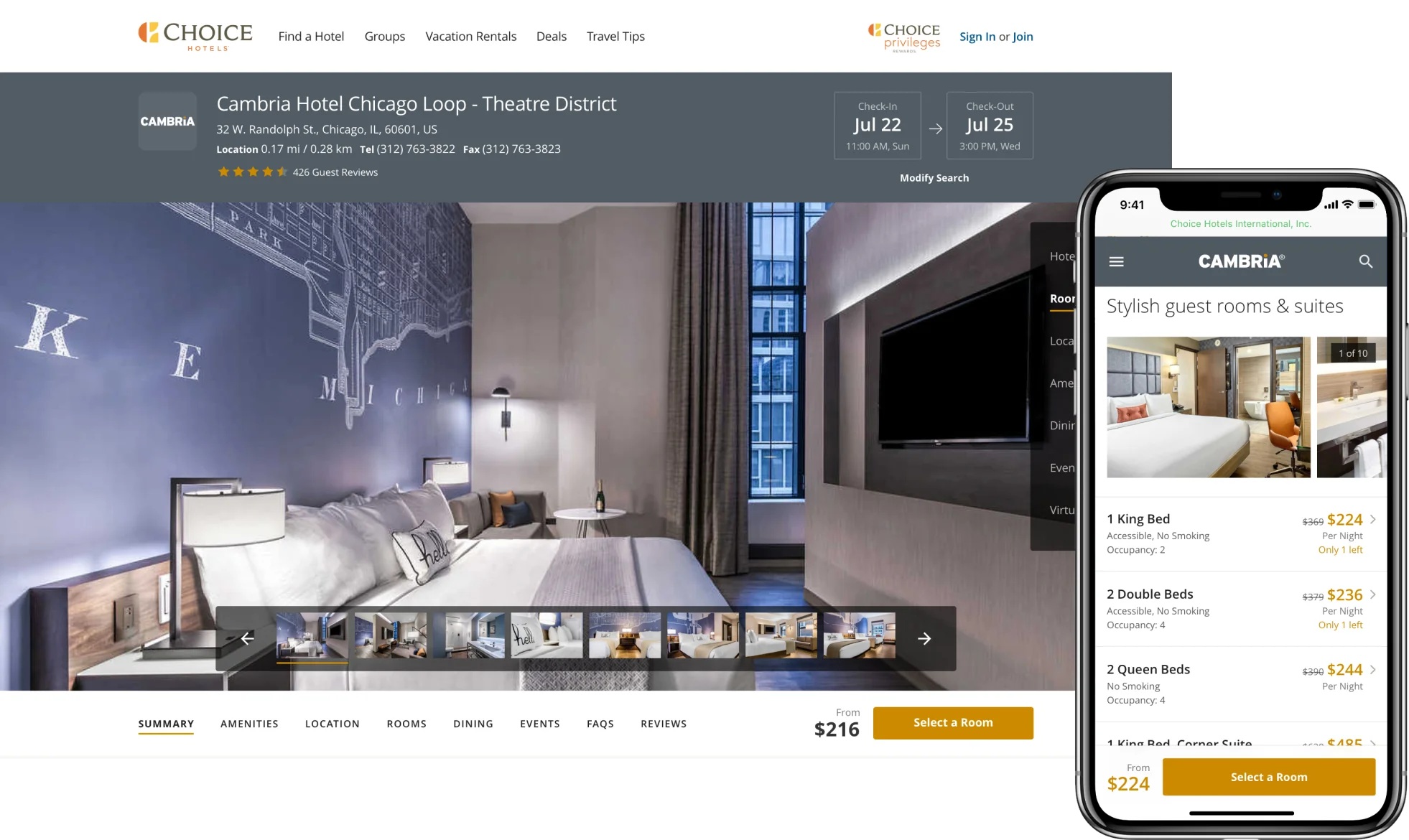
Developing a Distinguished Desktop Experience
As the finishing touches were completed for mobile booking, we turned our attention to the desktop experience. The desktop conversion rate was already high. However, Choice’s business strategy had shifted over the years, so the website needed to shift too. Choice is building up their upscale brands (Cambria and Ascend), whose customers have different needs and wants from guests who stay at midscale and economy hotels. The problem was the Choice website used a one-size-fits-all approach, so it wasn’t providing the information upscale customers need, nor distinguishing the premium experience they would get at a Cambria or Ascend property.
To solve these challenges, Drawbackwards worked through the design thinking process again, from research and journey mapping, to sketching and UX design, to testing and iteration. We hypothesized that the solution may be three unique templates for the website: one for economy brands, one for midscale brands, and one for upscale brands. However, as we worked our way through the process, we realized a different solution would better meet the user’s and company’s needs: a modular system to build unique templates for each brand that highlight the specific information each brand’s guests are looking for.
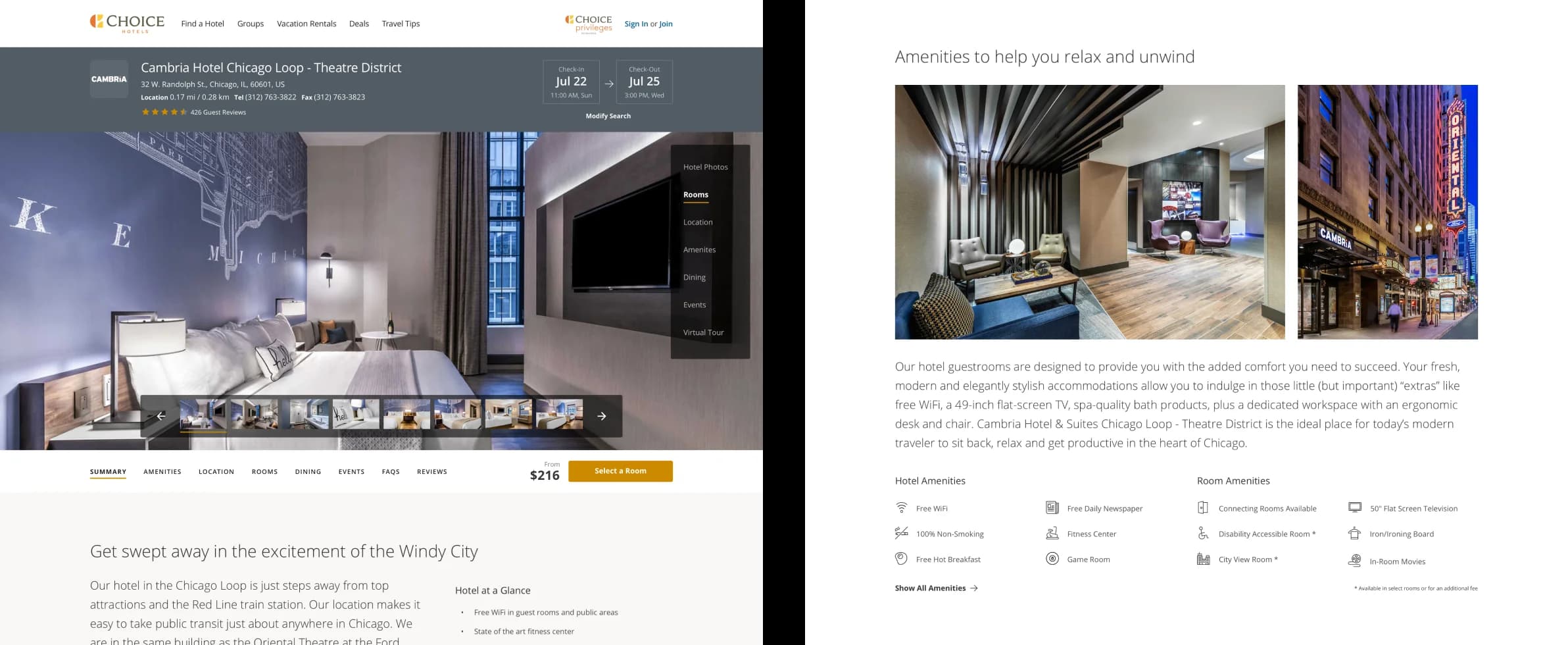
A Modular Design System That Balances Consistency and Customization
After prototyping and testing this modular concept, it proved to be an ideal solution. Now, Choice’s team can quickly build pages that show off the amenities and information that are most relevant to each brand’s guests. For example, Cambria properties are geared towards business travelers, who want to know about amenities like free wifi, on-site restaurants, bars, fitness centers, and laundry services. On the other hand, Comfort Inn guests often travel with their family, so want to see if the property offers free hot breakfast and has a pool.
The new design accommodates these unique needs with a collection of content elements that can be plugged into each page. This design system was also created with internal constraints in mind, such as the fact that property photos vary in size and quality. By keeping in mind both internal requirements and customer needs, we developed a modular solution that helped both sides succeed.