Tuft & Needle

From Expensive Hands-On Support to Simple Self-Service
Tuft & Needle set out to transform the painful process of shopping for a mattress into an easy e-commerce experience. The downside of being an innovator in an old-school industry is that many consumers don’t totally understand how it works, which was resulting in a high volume of emails, calls, and live chat messages. Tuft & Needle needed a way to reduce the number of “Contacts Per Order” (one of their key metrics), so they partnered with Drawbackwards to quickly find a simple solution to their complex customer support problem.
Obvious Problem, Not-So-Obvious Solution
Tuft & Needle had an extensive Support page on their website, yet their Customer Experience Team was still overwhelmed with support inquiries. Even more frustrating, many of the questions they received were about very basic information that was often right in front of the customer’s nose. Tuft & Needle wanted to fix the problem quickly, so Drawbackwards embarked on a two-week sprint with their team to research, prototype, and begin testing a solution.
Pressing “Fast Forward” on the Research and UX Design Process
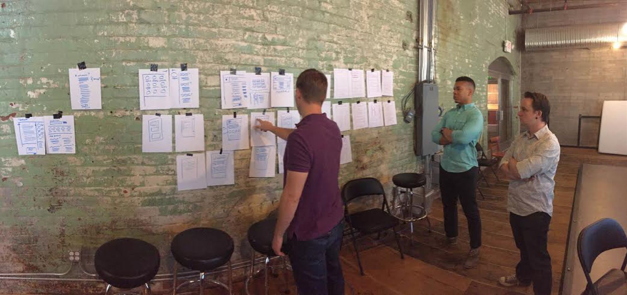
To kick off the project, we began with a design thinking workshop to uncover the common questions Tuft & Needle was receiving (such as “How do I return my mattress?”) and how customers were using the existing Support page.
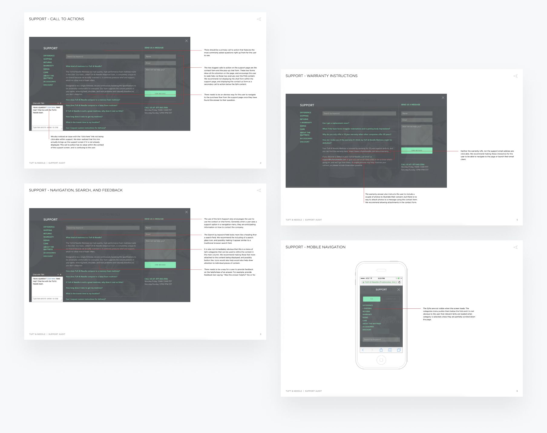
With this information in hand, the Drawbackwards team did a thorough audit and redline of the Support page to show breakdowns in UX design, development, and copy on both desktop and mobile. We then met with Tuft & Needle for a pair sketching session to collaboratively create potential solutions that would provide clarity for customers and reduce support requests.
A Quick Fix with Long-Lasting Results
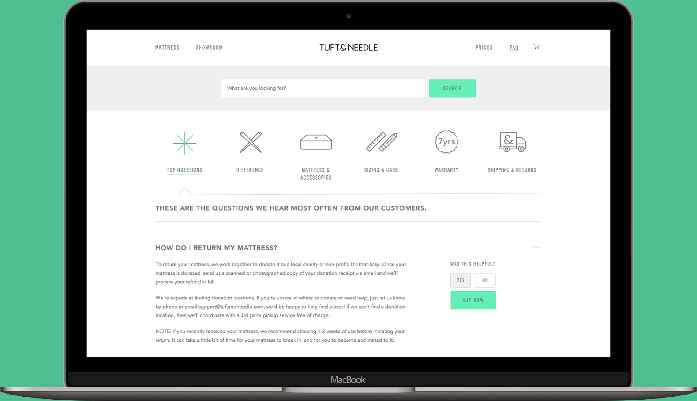
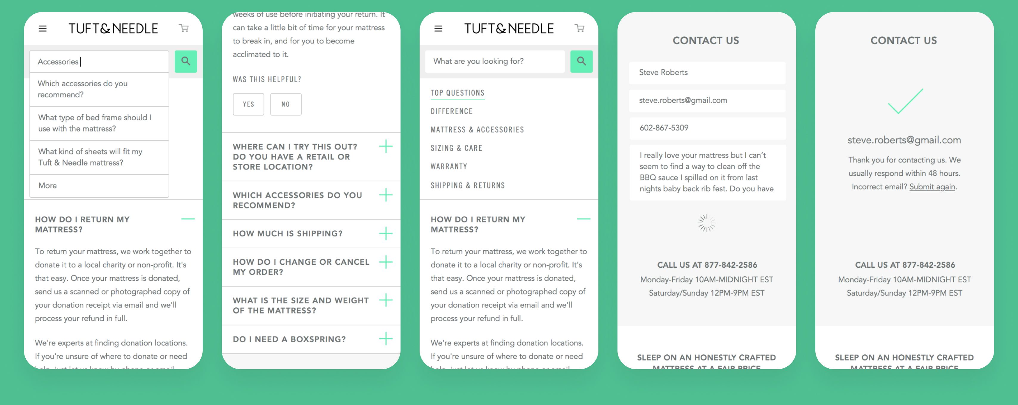
After the design thinking workshop and two-week sprint, Tuft & Needle implemented several fixes to the Support page, including recategorizing the questions and surfacing top questions to make them easier to find; implementing a “Was this helpful?” widget after every question to track the most common questions and gauge the quality of the responses; and making the search feature more usable.
After A/B testing, Tuft & Needle noticed customers were better able to find the answers to their questions with the new design, leading to a significant reduction in Contacts Per Order and proving that focusing on user success leads to business success.