No. 6: The Art of Interaction Design
This is the sixth installment of our series on the 12 Competencies of UX Design.
Think back to your childhood (or, depending on your age, the last 80s movie you’ve watched) and visualize your favorite arcade game. Imagine yourself standing in front of it, with a stack of quarters in hand.
Now you put a quarter in the slot. A cheerful flash of lights, a chirpy jingle, and a brightly-colored “start” screen responds. That quarter drop means you’re in the game!
Even without the chirpy jingle and flashing lights, the “start” screen probably would have been enough to signal you to start playing — but it wouldn’t have felt the same. Something about the machine interacting with your input in a delightful, stimulating way made the experience that much better.
The same principle applies for virtually any digital product or experience. Just like an arcade game, a quality digital experience not only responds to the actions of a user (what we call feedback), but also leverages that feedback to help users achieve their goals in the best (and most delightful) way possible.
We call this interaction design, and it’s a critical element in user experience.
The Five Principles of Great Interaction Design
In our last post about the importance of context, structure, and flow, we discussed how successfully leveraging those elements ultimately reduces user friction. Interaction design similarly plays an enormous role in reducing friction, since it is the “language” and "feeling" that ties a workflow together.
The best way to understand interaction design is to see it done well. Let’s look at the five principles of successful interaction design — using the Drawbackwards website as an example:
Great interaction design helps users achieve their goals
Ultimately, interaction design helps a user achieve a goal. It communicates to a user when they interact giving feedback, advancing them from where they’ve come from, and starts taking them where they need to go next.
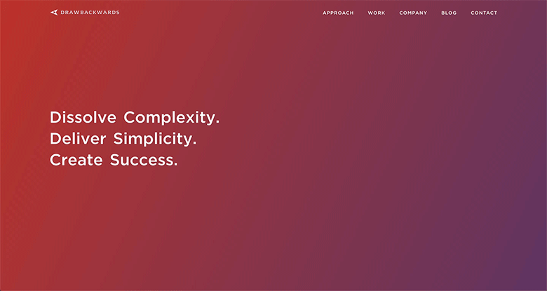
On the Drawbackwards site, one goal a user may have is to find out how Drawbackwards improves user experience and then decide if we’re the right team to help them do it.
On our homepage, we start by saying the end state of what they would want to achieve by showing the words “dissolving complexity, creating simplicity”.
Once we have established where we are going, we prompt them to take the next step in achieving that goal. "Let's Begin"
We continue this process of moving them through the site, introducing the Drawbackwards approach. At the end of that intitial content, the interface provides interactive elements at the bottom of the page, like this...

By assisting users through the site with elements like wayfinding copy on buttons, arrows, and light hover effects, they are able to interact and move toward their next goal or draw their next conclusion more easily and in a way that feels comfortable and intuitive.
Great interaction design helps users to achieve their goals in a variety of ways.
Every user is different, which means their goals (and even their preferred method for achieving those goals) are diverse. Great interaction design not only takes these diverse methods and goals into account, but creates flexibility so that different users can achieve their unique goals in the best way possible.
How? Let’s take another look at our example…
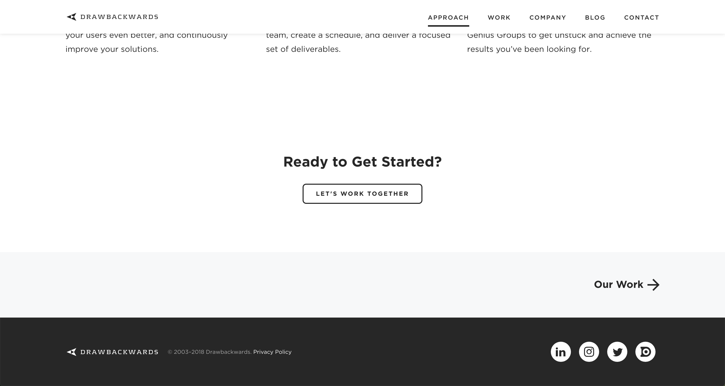
When a user reaches the end of a page of content, they may feel that they have enough information to contact Drawbackwards (so we give them a button to do so). On the other hand, some users will want to learn more before contacting us, so we’ve created a route for that, too — and signified it with an arrow and text that changes color when hovered over.
These elements might seem small, but they mean a lot to a user, easing and guiding them from their state of mind.
By adapting interaction design to allow users to achieve their goal, in the way they’d prefer, we help a user to feel empowered and understood rather than confused or overlooked.
Great interaction design helps a user know what to do next.
Since the purpose of interaction design is to allow a user achieve their goal by helping them navigate in a workflow, one of its most important functions is to communicate next steps in a way that a user will understand.
Let’s take a look at a very specific portion of the Drawbackwards website — our section on our Design Thinking approach — to see how it’s done.
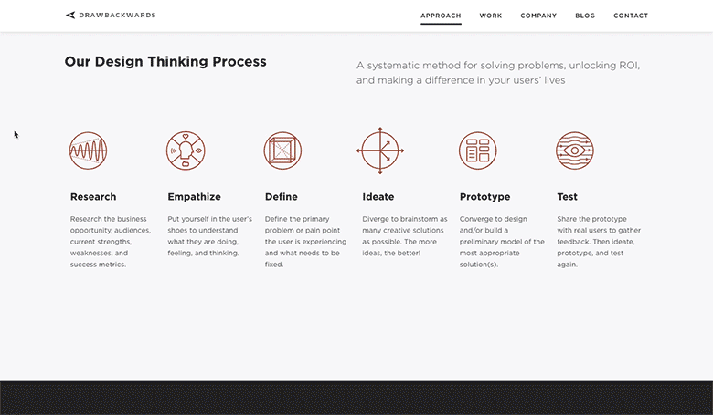
In this section of the site we want users to be able to:
-
Easily see how each step in our Design Thinking process builds on the previous step; and,
-
Freely explore and engage with each step at their own pace and in the order they prefer.
In order to communicate this, we use both an arrow to visually signify “next”, while also underlining the current step they are reading in a sequenced menu below it.
This helps a user visualize the entire Design Thinking process end-to-end in a line, while also giving them the freedom to read details about each step in the order they prefer. The arrows guide them along a particular path, while the linear menu helps them hop around freely without getting lost or confused.
Great interaction design takes constraints and context into account.
One of the hallmarks of great interaction design is its ability to deliver clarity and simplicity within a user’s constraints.
These constraints can be anything from their state of mind (“I’m stressed about my card being declined, so I need to check my account balance quickly”) to their device (“I hope I can check into my flight on my phone while taking a Lyft to the airport”).
Thinking through how and why a user might be feeling, thinking, or doing something while moving through their life helps interaction designers create experiences that fit within those constraints.
As an example, let’s take a look at the difference between the Drawbackwards desktop site and the mobile site:
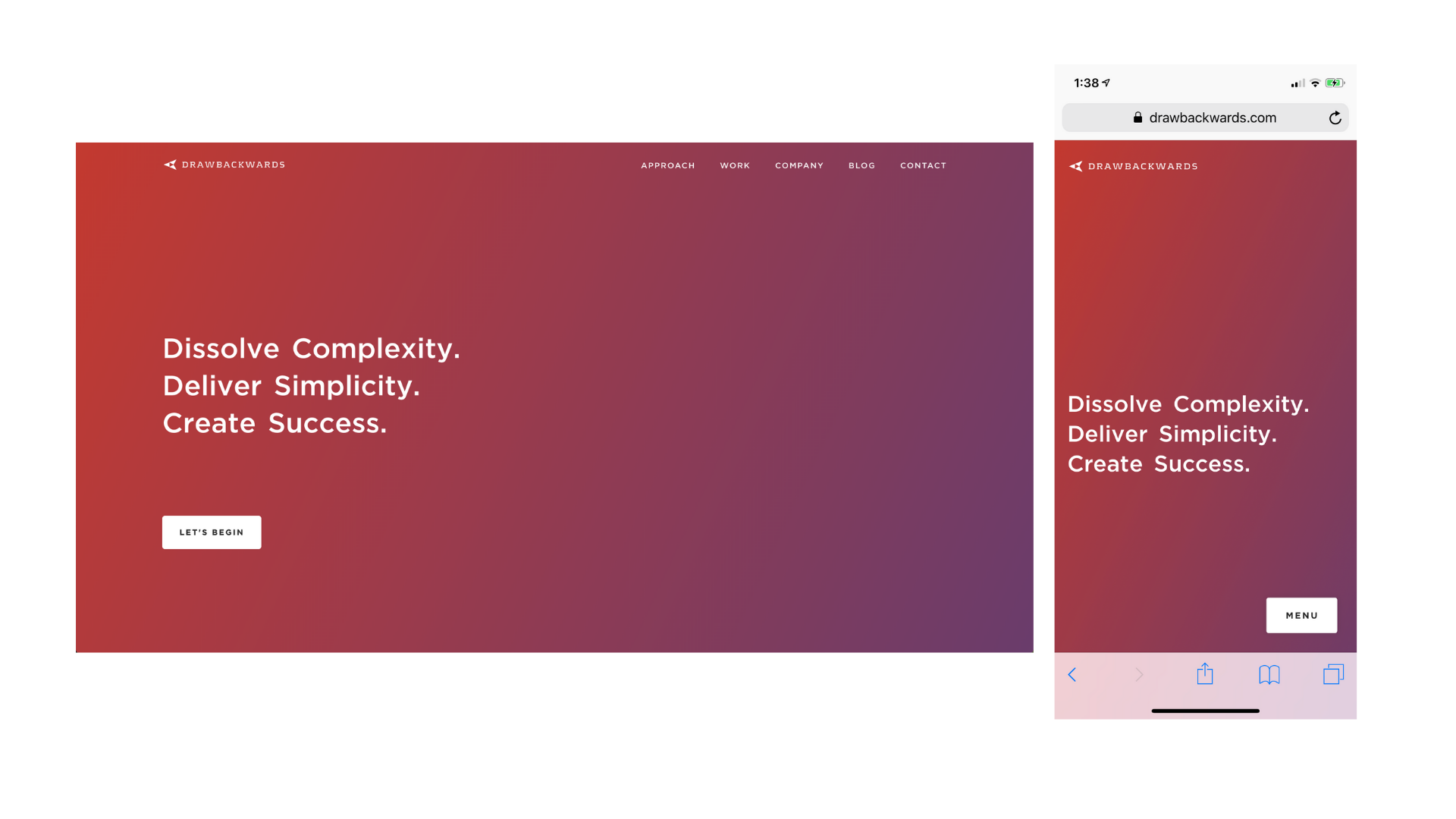
Notice anything?
The location of the main navigation on the desktop homepage is at the top, where it has the best visibility and usability for a desktop user. Look at the mobile version, and see that menu is located at the bottom — where a mobile user’s thumbs can reach and activate it.
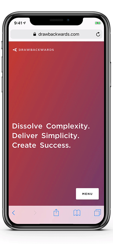
We do this because users on a mobile phone will have different constraints than a user on a desktop computer. We adapt the interaction design of the mobile version to better suit the constraints of this type of user. Additionally, we adapt the interaction and content consuption workflow. On desktop, a white button asks the user to begin a story while a menu is expposed above. On mobile, a white button activates a mobie menu that allows the user to go into the story through "Approach" or jump to any other menu content easily.
Great interaction design allows users to easily learn new processes.
No matter how well a workflow or experience is designed, there is always a learning curve for first-time users. Ideally, the process of moving through a particular workflow or experience gets easier over time. In order to help users learn new processes, great interaction design usually strikes a careful balance between established UI patterns and new elements.
As an example, let’s take another look at our Drawbackwards mobile site menu:
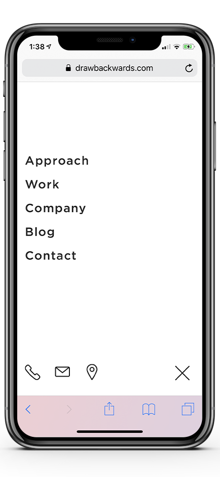
Take a look at the icons in the bottom left corner. What do those icons mean?
Our experience with user research shows that almost anyone who uses a smart phone could easily identify the “call” and “email” icons and to a lesser degree the “location” pin icon even though there are no words to indicate it. That’s because we leveraged very recognizable icons on our mobile menu that match icons used on most mobile interfaces.
Simply put, we use visual language that users already recognize to make it easier for them to learn how to achieve their goal easily.
The Art (and Science) of Interaction Design
Interaction design is a discipline that is equal parts a science and an art. While much of what works in interaction design is influenced by data and testing, truly great interaction design demands a high level of creativity, storytelling and emotional intelligence.
Good interaction designers will know how to move an interaction forward by making it clear and engaging, great ones know where to add delight and meaning without disrupting the task at heand.
Great interaction work is influenced by a certain level of intuition, empathy and creative boldness that unlocks delight and meaning in the interaction. That includes things like adding a piece of content that lightly assists or reassures the user at the moment of interaction, or taking a step out of a process that isn't needed or can be presented later after the core interaction is complete.
This is why the art of interaction design is such a critical competency in user experience. Without a certain level of artistry, experiences would never ascend to the top rung of the experience success ladder. Thus, the art of interaction design is a key component to delivering the meaningful experiences that modern consumers crave, show fierce loyalty to and send to their friends.