The Design Handoff: How a Component Library Can Make Your Design System Stronger
Turning high fidelity static designs into a living breathing product with interactive elements and multiple states is harder than it sounds. And it already sounds pretty hard.
It’s similar to turning the blueprints for a home into a livable three-dimensional space. You need solid plans from designers and product managers that not only convey the vision for the house, but also lay out how it’s all intended to come together. But to make it a reality, developers need the components to actually build the house one piece at a time. And they need to know how those components look and feel in different parts of the house while maintaining the overall look and feel the designers intended.
We’ve previously covered why you need a strong design system and how to build one. The path from brand guidelines to a fully mature visual design system is rife with peril. Some of the biggest dangers come in the hand-off between designers and developers.
The Role of the Component Library
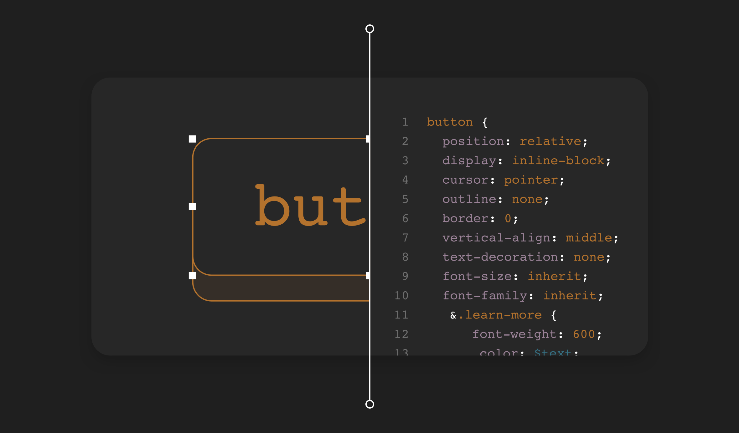
That’s where the component library comes in. This often overlooked piece of a strong design system defines how components should be used and re-used throughout your application or product. It’s not enough to communicate the different shades of colors to be used in things like buttons or navigation menus. Developers also need details about a variety of states and transitions - like how the color fades in and out when the user hovers over a button.
The component library provides a single source of truth that fully defines and visualizes each component and provides the actual snippet of code that will be copied and re-used throughout the product. It allows discrete levels of options to be captured for each component so developers know what is available to them. Without a fully encapsulated component library, it’s more likely that developers will unintentionally misuse the code, misinterpret the designs, or spend a lot of time rebuilding components they haven’t touched in months or years.
Component Libraries Aren’t Just for Developers
States are probably the most important (and overlooked) aspect of any component, and they go beyond the basic hover states familiar to most users. Complicated components can have dozens of potential states.
Think of a calendar or date picker on a website. Not only can it have multiple input fields, but it can have multiple states for each field. What does it look like if the user clicks into the end date field? You’ll probably want one state for when only the start date is selected, another state for when only the end date is selected, and yet another state for when the whole range of dates is selected.
When consistently executed, these active and focus states help the user more easily complete their intended action while also reinforcing the overall brand, look and feel of the product. Poorly defined and executed states can diminish your brand.
The more sophisticated the component, the more sophisticated the states. For example, when a Facebook post first loads on your screen it often won’t deliver the full content right away, especially if you’re using mobile data with a spotty connection. You’ll first see the outlines of the post with bars that indicate the outer frame so you know to wait for the real content that’s still to come. Some loading states, like videos, include progress bars to show you how much longer you may have to wait before the content starts to play.
Flat visual designs delivered in tools like Zeplin or Sketch can only go so far in communicating these dozens of different states. Most files in these popular design tools will do the basic simple states but the more complex loading states just don’t scale well when you have 20 to 30 forms of the same component.
That’s why a component library is not just for developers. Designers and product owners benefit too from having all these fine touches defined so the product or application looks and feels the way it was intended and the brand is brought to life through the experience with the components.
Why Doesn’t Everybody Have a Component Library?
If component libraries are so important and great for a digital product, why doesn’t everybody have one? For the same reason that anything isn’t done right - lack of time, money, coordination and awareness.
Many entry-level designers aren’t trained to think about states, especially if they started in a static design background. You’d think that wouldn’t be a problem in 2020 when so much of design is inherently fluid and not static, but it takes time to change how designers are trained and educated.
A good interactive designer needs to consider at the very least the core base states. Almost any component will have at least a hover, active, and focus state, but many designers will stop at the hover state and forget the other two.
But it’s also not just on the designer to figure out every possible state for a component. There’s a line when a state becomes an interactive element rather than a business requirement, and that can require additional inputs at various points in the product life cycle.
Take, for example, a regular button on a web page. The designer might initially include all three states for that button and hand it off to be implemented in the product. But what if that button later becomes a specialized button in a new payment flow? Maybe the button shows your stored credit card information so the user knows which card is being used, but from there it can do any number of things depending on the situation. It could show one kind of error if the card is expired and a different kind of error state if the card is rejected.
There could potentially be a dozen or more types of error states that the designer can’t realistically catch on their own in the first pass. It requires other input from the product team, developers and even brand managers deciding the purpose of the component, the intention of the message it’s trying to convey, and the tone and voice it uses in the process. Shared requirements and context between all stakeholders are an important part of building a good component library.
Another important obstacle that often stands in the way is having the right match of tools and technology to manage your component library. Storybook is the most popular tool but only works for single-page frameworks. Like many tools, it has gained popularity because it has become ubiquitous, not necessarily because it’s the most useful tool for every situation. If you have a legacy code base like PHP frameworks, you won’t find a lot of tools that support it, and it can take a lot of time to build a custom library by plotting out components to show all the possible uses. Zeplin and Sketch offer some solutions that can help, but they fall short in their own ways.
Why do I Need a Component Library?
Component libraries, and by extension design systems, aren’t really complicated as much as they require a lot of attention to detail. If you work on a team with a complex code base, your library will likely be more complex, which means everybody working within it needs to be diligent to keep it updated and clean.
You’re not maintaining a component library for yourself as much as you’re doing it for other people. If you’re the only developer building a product on your own, chances are you’re not going to get much ROI out of a component library early on because you don’t need to look up details - it’s all in your head. But as you acquire more people, all of whom start working in the same code base, you’ll wish you had that knowledge recorded somewhere outside your head.
Think of it like the Library of Congress - the authoritative source of all possibilities for your product. Most companies don’t have that kind of complete authoritative record, but most should. Why? Because if it’s not complete, then developers will stop relying on and using it. A library stops being effective when the books are all over the place in no particular order. Similarly, if developers can’t easily find what they need in your component library, they’ll just dive into the code and extract what they need, or they’ll try to interpret the designs their own way. Soon, you’ll have a collection of a lot of different interpretations. The point of a design system and a component library is to eliminate interpretations as much as possible.
How Can I Set Up a Component Library?
The more mature your code base, the less consistency you likely have within it. Your biggest challenge will be distilling all those different flavors of the same components into one source of truth. Your first big project will be to simply catalogue all the varieties of the same components in your code and consolidate them so you can choose what needs to stay and go.
As a guiding principle it’s important, though, to take an incremental approach. You don’t want to stop everything to build your library. At the same time you don’t want to just do a few components and call it a day. It will take extreme discipline and buy-in from your product team, designers and developers to all agree that it’s worth the time and effort to build a component library.
It can be tough to get started because it’s a daunting task and you won’t see the ROI for a while. That’s why a poorly managed (or missing) component library can be a huge contributor to your technical debt. Everybody sees it as important in theory, but nobody is eager to prioritize the time and resources it will take to address it.
If that all sounds like a lot for your team, we can help. We have experience completing code audits for teams, helping them identify, define and build new components from scratch, and get rid of the ones that no longer fit. And we can help train your team to think component-first when designing and developing your product so you can clean up the variations in your code and thoughtfully build a new library that will actually get used and become a living breathing space for your product to live.
Start a conversation with us to see how we can help.