Financial services company case study: A faster way for big merchants to add new locations
Financial services · Fortune 100
Years: 2018–2019
What we did: Customer research, Success workshop, Journey mapping, Service blueprints, Future-state design, Roadmap
How do you make it easy for a merchant doing $1M+ a year with you to open one more location?
A Fortune 100 financial services company asked us to fix how its largest merchants add new locations to their accounts. Requests came in by phone, chat, fax, email and old spreadsheets, then passed between several teams before a merchant could take a first payment.
Over six months we interviewed merchants, customer care teams and client managers, ran workshops with their leaders, and mapped the whole service as it really worked. Then we designed the future state with them: one guided intake for every channel, a status everyone can see, and review steps only where they add value.
- 7 Research and workshop engagements in six months
- 0.1% Of requests caught by a review step that added a day of waiting
- Days → min Projected time to add a location in the new design
The challenge
Merchants with more than $1M a year in card volume add new locations through a process the company calls Branch Additions. It had grown up across several departments, and each one had its own map of only part of it.
Most requests were done within four days, but only through workarounds. Merchants didn't know what to send, used old forms or their own spreadsheets, and called back to ask where things stood. Customer care teams kept their own notes and desk guides to remember which merchants got special handling.
“I wish I knew what was required ahead of time!” A merchant, in our research.
Mapping the service as it really works
We interviewed and observed merchants, front-office and back-office customer care teams and client managers, ran listening sessions and surveys, then built service blueprints that show every entry point, handoff and feeling along the way.
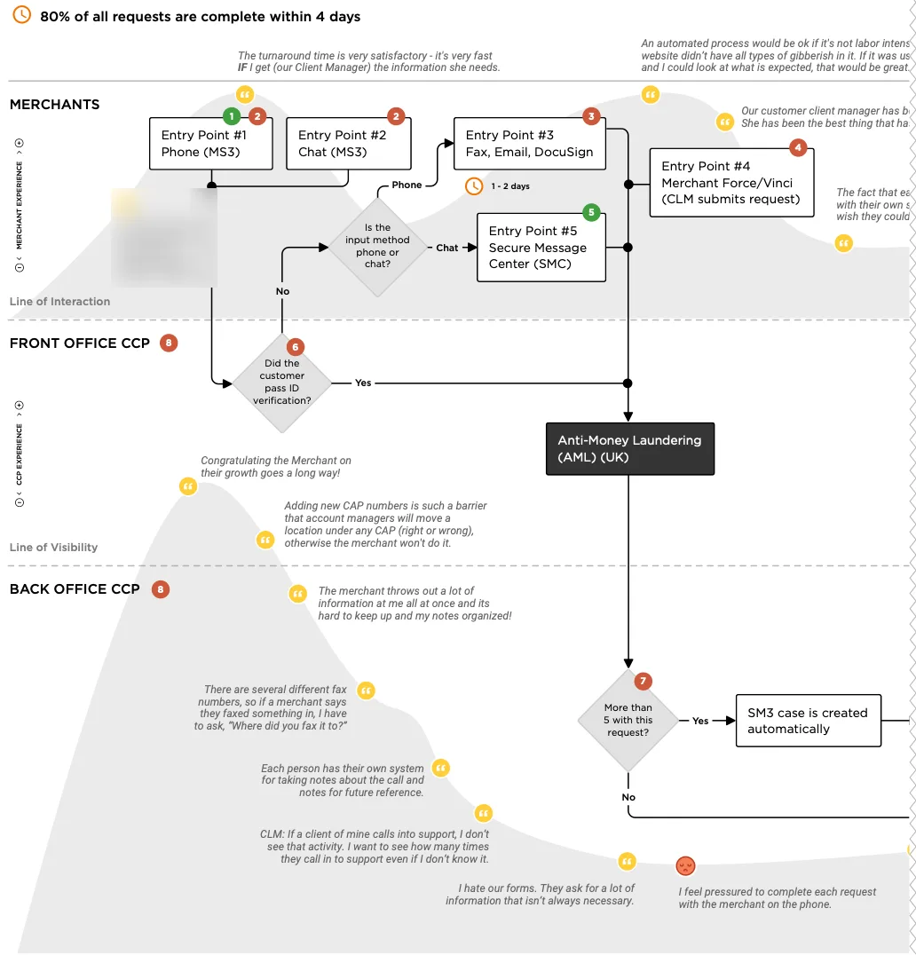
Three findings mattered most. A duplicate review caught only 0.1% of requests in a year but added at least a day of waiting. The intake was confusing, with too many channels and forms. And with so many handoffs, nobody owned a request or could see its status.
Designing the future state together
In a future-state workshop with the client team we sketched the ideal experience: one smart, guided intake that asks only for what each request needs, works the same by web, phone or chat, and won't move forward with something missing.

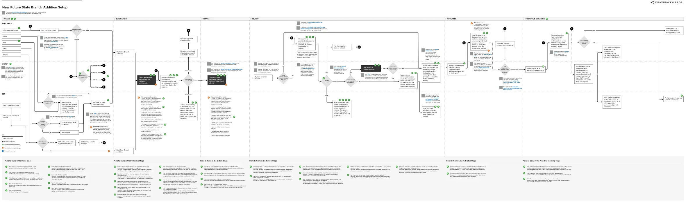
Then we turned it into a detailed future-state blueprint. The system carries the routine work, review steps run only where they add value, and merchants and staff see the same live status. Each step is tied to the pain it removes.
A plan they could act on
We scored the experience on our Ladder: today it sat at Functional and Usable, with only flashes of Comfortable. The goal was solidly Comfortable for everyone, and Delightful where it counts.
We closed with a prioritized roadmap in three tiers, starting with the intake because fixing it prevents the most problems downstream, followed by status tracking, one set of forms, and cleaner help content for the care teams.